A user journey map template gives you a structured way to turn scattered observations about a user experience into one readable map. Instead of keeping research notes, analytics screenshots, support complaints, and product ideas in separate places, the template forces the team to answer a few practical questions: what stage is the user in, what are they trying to do, how do they feel, what gets in the way, and what should we improve next?
That structure matters. Teams often say they understand the user journey, but what they really have is a list of screens, a funnel chart, or a few strong opinions from recent meetings. A journey map is different. It shows the experience from the user's point of view, including the emotional lows and confusing moments that a normal product flow hides.
If you want to start with a ready layout, open the user journey map template. The rest of this guide explains how to fill it in so the result is useful rather than decorative.
When to Use a User Journey Map Template
Use a user journey map template when the problem is bigger than a single screen. If the issue is "the checkout button is hard to find," a wireframe or usability test may be enough. If the issue is "new users lose trust before they ever reach checkout," a journey map is a better tool.
Journey maps are especially useful for:
- onboarding flows where users understand the promise but fail to reach activation
- e-commerce journeys where people compare, hesitate, abandon carts, or need reassurance
- support experiences where frustration builds across multiple contacts
- B2B buying journeys where several people influence one decision
- feature adoption journeys where users see a feature but do not understand why it matters
The user journey map template is not only for designers. Product managers use it to prioritize fixes. Marketers use it to understand what message belongs at each stage. Support teams use it to explain recurring friction. Founders use it to see whether the experience they imagine matches what customers actually go through.
The Five Rows That Make the Template Useful
A journey map becomes useful when each row answers a different question. If every row repeats the same idea in different words, the map becomes a poster, not a decision tool.
1. Stages
Stages are the major phases of the experience. For a simple e-commerce journey, the stages might be:
- Discover
- Consider
- Purchase
- Delivery
- Loyalty
For a SaaS onboarding journey, they might be:
- Sign up
- First setup
- Invite team
- First successful outcome
- Return next week
The exact labels matter less than whether they match the real experience. Avoid generic stages if they hide important friction. "Onboarding" may be too broad. "Connect data source" and "Invite teammate" may reveal more.
2. User Actions
Actions describe what the user actually does at each stage. Keep them short and observable:
- searches for alternatives
- compares pricing
- adds a product to cart
- waits for an email
- contacts support
Do not write internal tasks here. "Sales sends follow-up" is not a user action. It may belong in a service blueprint, but the journey map should stay anchored in the user's experience.
3. Emotions
Emotion is what separates a journey map from a flowchart. Two users may complete the same steps, but one feels confident while the other feels anxious. That difference tells you where to improve.
You can use emojis, sentiment labels, or a simple high/medium/low curve. The format is less important than the conversation it creates. Ask: where does confidence drop? Where does uncertainty appear? Where is the user excited enough to continue?
4. Pain Points
Pain points should be specific. "Bad UX" is not specific. "Payment form asks for company tax ID before explaining why" is specific. "Slow" is vague. "Product image takes four seconds to load on mobile" is actionable.
Good pain points often come from:
- user interviews
- support tickets
- sales call notes
- session recordings
- analytics drop-off points
- usability testing observations
If you are guessing, still write the pain point down — just mark it as an assumption. A journey map can start as a hypothesis, as long as the team knows what needs validation.
5. Opportunities
The opportunity row is where the map becomes useful for planning. Each opportunity should respond to a pain point:
- Low trust → show real reviews earlier
- Missing details → add comparison specs
- Too many checkout steps → simplify the form
- Unclear delivery → send proactive updates
- No loyalty hook → offer a reason to return
Without this row, a journey map often ends as a wall of problems. With it, the map becomes a prioritization tool.
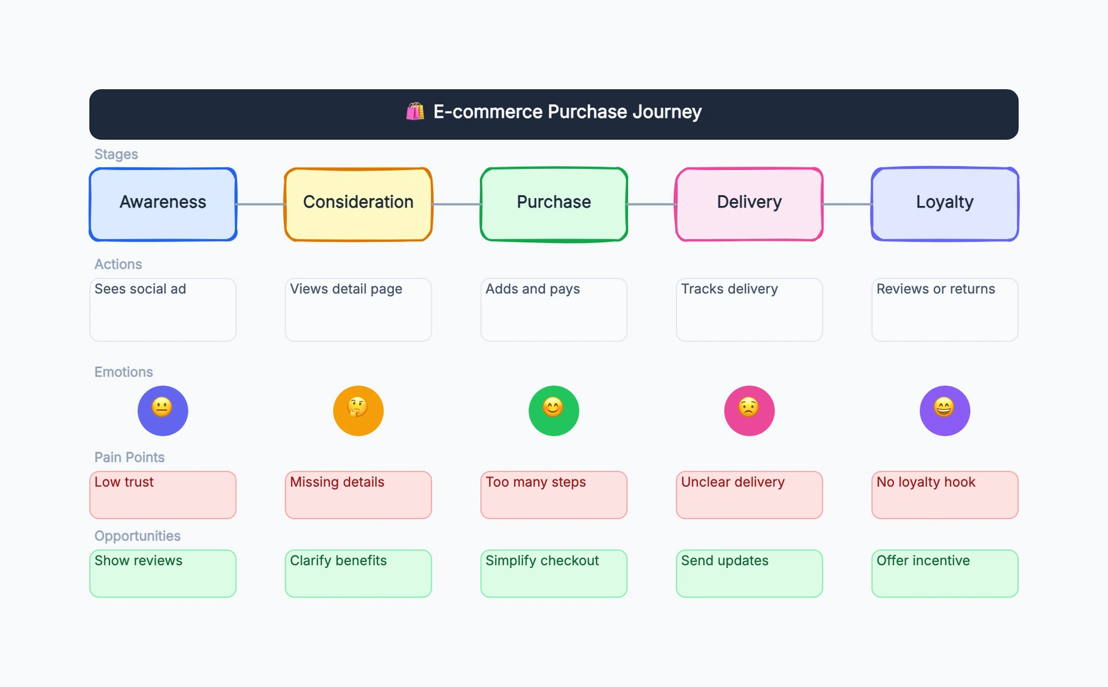
A Filled Example: E-commerce Purchase Journey
Here is a practical example you can copy into the user journey map template.
| Stage | User action | Emotion | Pain point | Opportunity |
|---|---|---|---|---|
| Discover | Sees a social ad | Curious but skeptical | Low trust | Show reviews and real customer photos |
| Consider | Views the detail page | Interested | Missing details | Clarify benefits, sizing, shipping, and returns |
| Purchase | Adds to cart and pays | Hopeful but cautious | Too many steps | Reduce required fields and show total cost early |
| Delivery | Tracks delivery | Anxious | Unclear delivery | Send proactive status updates |
| Loyalty | Reviews or returns | Happy if resolved | No loyalty hook | Offer a useful incentive or follow-up guide |
This example works because it does not treat "purchase" as the whole journey. Discovery and trust happen before checkout. Delivery anxiety happens after payment. Loyalty depends on whether the user still feels supported after the transaction.
That is the real advantage of journey mapping: it catches the experience around the product, not just the product interface.
How to Fill the Template Without Making It Too Vague
The most common mistake is writing a journey map that sounds plausible but cannot guide decisions. To avoid that, keep each cell grounded in evidence or a clearly labeled assumption.
Start with one persona or segment. A first-time buyer and a returning enterprise admin do not have the same journey. If you try to map both at once, the result becomes average and vague.
Choose one scenario. "Using our product" is too broad. "A first-time user tries to create and share their first diagram" is much better. A journey map needs a beginning and an end, even if the real experience loops.
Write in plain language. The best cells are short enough to scan but specific enough to act on. "Confused by pricing terms" beats "pricing friction." "Waits three days without tracking update" beats "delivery issue."
Separate observation from interpretation. "User opens email but does not click" is an observation. "User is not interested" is an interpretation. Put observations in the map when possible, then discuss what they may mean.
Leave blank cells if you do not know. A blank cell is useful because it shows where research is missing. Fake certainty is worse than visible uncertainty.
User Journey Map vs. Customer Journey Map vs. User Flow
These terms overlap, so it helps to separate them before choosing a template.
| Tool | Focus | Best for |
|---|---|---|
| User journey map | A user's experience across stages | UX friction, onboarding, feature adoption |
| Customer journey map | The broader customer relationship with a brand | marketing, sales, service, retention |
| User flow | Screens, steps, and decisions inside a product | product navigation and interaction design |
| Service blueprint | Frontstage and backstage service operations | operational redesign |
A user journey map is usually closer to product and UX work. A customer journey map often covers a wider relationship: discovery, sales, purchase, support, renewal, advocacy. A user flow is more technical and screen-focused. It tells you what path a user takes. A journey map tells you what that path feels like and where it breaks.
If your team is debating screens, use a wireframe or user flow. If your team is debating why users drop off, hesitate, or complain, use a journey map.
Where to Place the Template in Your Workflow
A user journey map template is most useful before solution design, not after. If the team has already decided what to build, the map may become a justification exercise. Use it earlier, when the team is still deciding what problem matters most.
A simple workflow looks like this:
- Pick one persona and one scenario.
- Fill the journey with current knowledge.
- Mark uncertain cells as assumptions.
- Add evidence from analytics, interviews, support, or sales notes.
- Identify the biggest emotional drop or friction point.
- Turn opportunities into product, content, or service experiments.
- Revisit the map after the experiment.
The map should not be frozen. A good journey map changes when you learn more. Treat it like a working canvas, not a final slide.
Common Mistakes
Mapping the happy path only. Real journeys include confusion, hesitation, retries, and abandonment. If the map only shows the ideal path, it will hide the moments worth fixing.
Mixing too many users together. If the map represents everyone, it represents nobody. Build separate maps for important segments when their motivations differ.
Writing internal process instead of user experience. "Marketing sends nurture email" may matter, but the user-facing version is "receives a reminder email and decides whether to return."
Skipping opportunities. A map full of pain points can create alignment, but it does not create action. Add the improvement row so the team can move from diagnosis to next steps.
Making the map too pretty too early. The first version should be easy to change. Polish is useful later, once the structure is right.
Start With the Template
You do not need a complex research program to start. Open the user journey map template, pick one real scenario, and fill the first draft in 20 minutes. Then bring it to the team and ask: which cell are we most unsure about, and which pain point would matter most if it were true?
That question is usually enough to turn a static diagram into a useful product conversation.
Related Reading
- What Is a User Persona? — define who the journey is for before mapping the experience.
- What Is a Wireframe? — use wireframes when the problem is screen structure rather than experience across stages.
- Free Wireframe Tools — compare tools for sketching screens after you understand the journey.