A feature comparison table is one of the hardest-working sections on a SaaS pricing page. It looks simple — plans across the top, features down the side, checkmarks in the cells — but the table has to answer a surprisingly delicate question: "Which plan is right for me?"
That question is not only about price. A buyer wants to know whether the free plan is enough for a small project, whether the Pro plan includes the features that save time, and whether Enterprise is genuinely different or just a bigger label. A good pricing table makes those differences obvious without forcing someone to read three paragraphs of sales copy.
This guide focuses on the practical version: how to design a feature comparison table for a SaaS pricing page. We will cover plan cards, monthly versus annual billing, checkmarks and dashes, feature grouping, enterprise plans, and the small layout decisions that make the table feel trustworthy. If you want a starting point, open the feature comparison table template and replace the sample plans with your own tiers.
Start With the Buying Decision, Not the Feature List
Most messy pricing tables start in a spreadsheet. Someone exports every product capability, adds three columns for Free, Pro, and Enterprise, and then tries to make the result fit on a web page. The table becomes complete, but not useful.
Before listing features, write the decision each plan is supposed to support:
- Free helps a visitor try the product with low risk.
- Pro is the recommended self-serve plan for serious users or small teams.
- Enterprise is for teams that need security, procurement, governance, or dedicated support.
That framing changes the table. You stop asking "Can we mention every feature?" and start asking "Which differences help a visitor choose a plan?" For a diagramming or whiteboard product, basic canvas editing might belong in every plan, while team spaces, export formats, API access, SSO, and audit logs separate higher tiers.
The table should not make every plan look equally dense. If every column has the same amount of text, nothing stands out. The recommended plan should feel like the natural upgrade path: enough value to justify paying, not so many enterprise-only items that it looks incomplete.
Use Plan Cards Above the Table
A feature comparison table works best when it sits under short plan cards. The cards answer the quick question: "What does this tier cost, and who is it for?" The table answers the detailed question: "Exactly what do I get?"
Each plan card should include:
- plan name
- price or pricing model
- one sentence describing the ideal user
- three short bullets that summarize the strongest value
- a visual marker for the recommended tier, if there is one
Keep the card copy human. "For growing teams that need collaboration, reusable templates, and exports" is more helpful than "Advanced productivity plan for modern organizations." Buyers are not grading your adjectives; they are trying to locate themselves.
For the Pro plan, the pricing line can show an annual discount directly in context: a smaller struck-through original price, the discounted price, and a compact "Save 20%" tag. The visual relationship matters. If the original price and discounted price are far apart, the discount reads like a separate annotation rather than part of the price.
Enterprise is different. Do not force it into the same discount pattern if it is sold by contract. "Annual contract" or "Custom pricing" is clearer than pretending there is a simple monthly price with a universal discount. Enterprise buyers expect negotiation, procurement, security review, and support terms. Treat that plan as a contract path, not a coupon.
Show Monthly and Annual Billing Without Rebuilding the Table
If your product offers monthly and annual billing, users need to compare both. A common mistake is to create two completely different pricing sections. That makes the page feel unstable: users switch to annual billing and suddenly the layout, emphasis, or feature wording changes.
A cleaner approach is to keep the same structure and change only the billing state:
- the toggle switches between monthly and annual
- the plan cards update the price line
- the annual discount stays visible near the annual option
- the feature comparison table stays in the same position
This is why a two-scene pricing template is useful for design work. One scene shows monthly pricing. The other shows annual pricing. You can place them side by side while you review the copy, but the final website can still use a single interactive toggle.
The annual state should not hide the discount in a footnote. If the discount is a real buying reason, show it near the price. A small tag works well because it is visible without overpowering the plan name or the price itself. Avoid huge discount badges that make a serious B2B pricing page look like a retail promotion.
Choose Cell Values That Readers Can Scan
The purpose of a feature comparison table is not to display data. It is to reduce hesitation. The cell format should help the reader scan patterns quickly.
Use a small set of symbols and labels:
- ✓ for included
- -- for not included
- Limited for partial support
- short numbers for measurable limits, such as "5 projects" or "100 exports"
- short notes for conditions, such as "Annual only" or "Add-on"
Do not leave blank cells. A blank cell can mean "not available," "not checked yet," or "we forgot to fill this in." On a pricing page, ambiguity creates distrust. A dash is better than silence.
Also avoid mixing too many meanings into one row. "Advanced export and API access" should probably be two rows because a plan might include one but not the other. Rows should represent decisions a buyer can understand independently.
For a SaaS product, useful comparison rows often include:
- core editing or creation features
- template or asset library access
- export formats
- collaboration and comments
- team workspace
- history or version control
- integrations or API access
- SSO and permissions
- support level
- audit logs or compliance controls
The exact feature names should match customer language. If customers ask about "single sign-on," write "SSO" only if your audience recognizes it. If they ask about "export to SVG," do not hide it inside "advanced sharing."
Group Features by Buying Concern
A long flat table becomes tiring after about a dozen rows. If your product has many features, group them by buying concern rather than by internal team ownership.
Good groups might be:
- Creation: editor, templates, imports, exports
- Collaboration: comments, team spaces, permissions
- Automation: API, integrations, webhooks
- Security: SSO, audit logs, data retention
- Support: email support, priority support, dedicated success
This structure matches how buyers think. A founder scanning for "Will my team collaborate?" can jump to Collaboration. An IT reviewer scanning for "Can we deploy this safely?" can jump to Security.
Keep the first visible rows focused on the features that separate tiers. If every plan includes basic editing, that row can be included, but it should not be the star. The highest-value rows are the ones where Free differs from Pro, and Pro differs from Enterprise.
The table should tell a story:
- Free is useful for trying the product.
- Pro unlocks collaboration and serious daily usage.
- Enterprise adds governance, security, scale, and support.
If the rows do not support that story, the table may be accurate but weak.
Make the Recommended Tier Visually Obvious
Many SaaS pricing pages have a preferred plan. Usually it is the middle plan: paid enough to support the business, accessible enough for self-serve buyers. The feature comparison table should reinforce that choice without making the page feel manipulative.
Use one or two cues:
- a "Recommended" tag on the Pro plan card
- a slightly stronger border or background on the recommended column
- clearer value bullets in the plan card
- feature rows that show where the plan meaningfully improves over Free
Do not make every cue shout at once. If the recommended plan has a bright border, a large badge, a darker background, a giant CTA, and more checkmarks than anything else, the design starts to feel pushy. The goal is to guide, not trap.
A useful test: if you remove the recommended badge, would the Pro plan still look like the sensible choice for the target customer? If yes, the table is doing real work. If no, the badge is covering for weak packaging.
Handle Enterprise Plans Honestly
Enterprise pricing is where many comparison tables become weird. Teams try to keep the grid symmetrical, so Enterprise gets a fake monthly price, a fake discount, or a vague "Contact us" cell repeated everywhere.
Enterprise is not just a larger Pro plan. It often includes a different buying process:
- security review
- procurement paperwork
- custom contracts
- SSO and advanced permissions
- data residency or compliance requirements
- dedicated support or onboarding
- invoicing and legal terms
That is why the pricing card can simply say "Annual contract" or "Custom pricing." The feature table can still compare capabilities, but the price line does not need to pretend Enterprise is self-serve.
If a feature is available in Enterprise only through a custom add-on, write that clearly. "Custom" is better than a checkmark if the buyer needs to talk to sales before getting it.
A Practical Layout for a SaaS Feature Comparison Table
Here is a simple structure you can adapt:
Plan cards
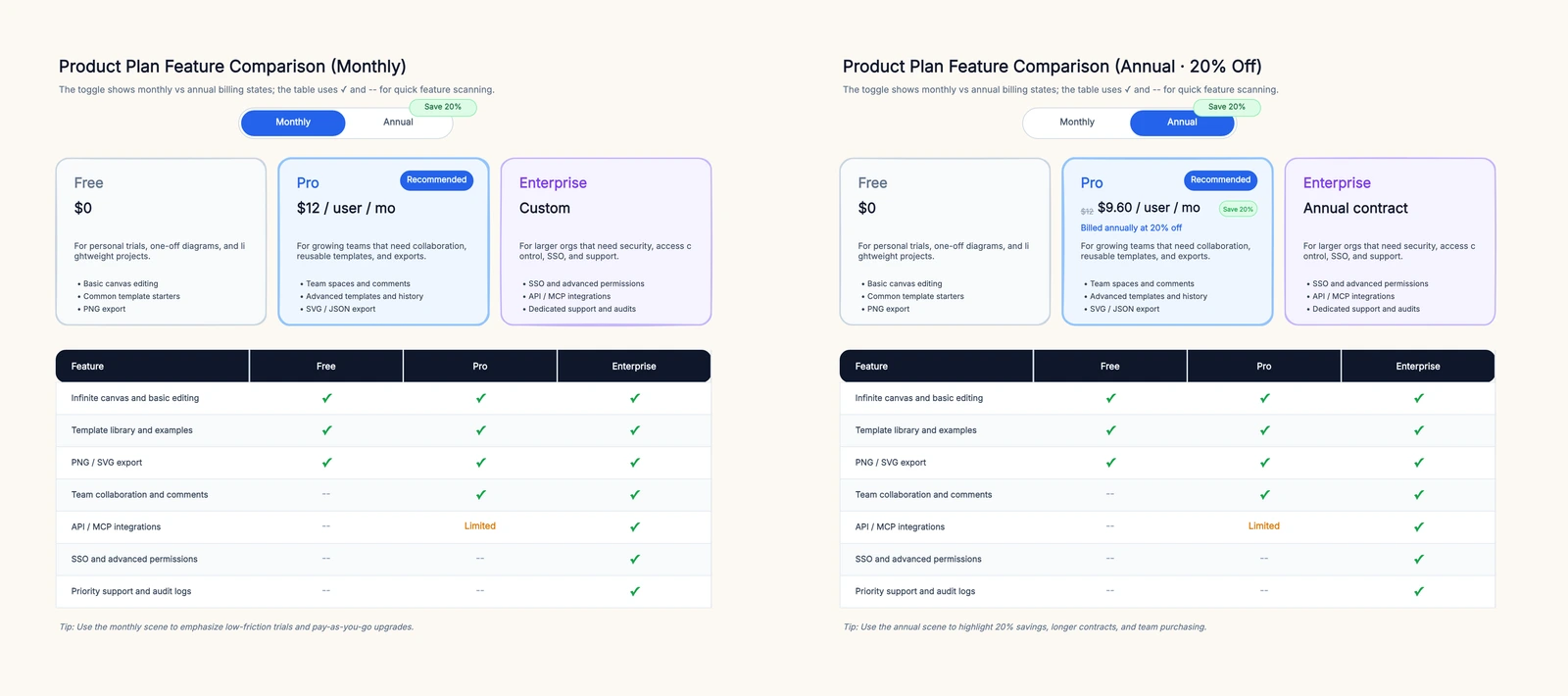
- Free: $0 — for personal trials and lightweight projects
- Pro: $12 monthly, or $9.60 annually with a small "Save 20%" tag — for growing teams
- Enterprise: annual contract — for organizations with security and governance needs
Feature rows
- Infinite canvas and basic editing: ✓ / ✓ / ✓
- Template library and examples: ✓ / ✓ / ✓
- PNG / SVG export: ✓ / ✓ / ✓
- Team collaboration and comments: -- / ✓ / ✓
- API or integration access: -- / Limited / ✓
- SSO and advanced permissions: -- / -- / ✓
- Priority support and audit logs: -- / -- / ✓
This is not an exhaustive table, and that is the point. It gives a buyer the first answer quickly. If they need every technical limit, you can link to docs or add an expandable detail section below.
The feature comparison table template follows this pattern with separate monthly and annual scenes, plan cards above the table, and a simple grid using checkmarks and dashes. Use it as a working draft rather than a finished website component: change the tier names, rewrite the bullets in your product language, and remove any row that does not affect the buying decision.
Common Mistakes That Make Pricing Tables Hard to Trust
Showing too many features. A 60-row table feels thorough to the company, but exhausting to the buyer. Put the decisive rows on the pricing page and move deep documentation elsewhere.
Using vague row labels. "Advanced features" is not a feature. "Version history" is. "Enterprise controls" is vague. "SSO and audit logs" is clearer.
Leaving cells blank. Empty cells create doubt. Use a dash for not included, "Limited" for partial support, and a short note for special conditions.
Making Enterprise look discounted. If the plan is contract-based, do not show a pretend monthly price or percentage savings. Enterprise buyers expect a sales motion.
Overdesigning the discount. Annual savings matter, but a huge discount badge can cheapen the page. Use a compact tag near the discounted price.
Letting the table contradict the plan card. If the card says Pro is for teams but the table shows collaboration only in Enterprise, buyers will hesitate. The card and table must tell the same story.
Final Checklist Before Publishing
Before you ship a pricing comparison table, review it as if you were a new visitor:
- Can I understand who each plan is for in five seconds?
- Is the recommended plan obvious but not aggressive?
- Does annual billing show the original price, discounted price, and savings clearly?
- Does Enterprise avoid fake discounts if it is contract-based?
- Are checkmarks, dashes, and partial labels used consistently?
- Are the rows ordered by buyer importance rather than internal product structure?
- Is every visible feature tied to a real buying decision?
A feature comparison table does not need to be clever. It needs to be clear. When the table is clear, visitors stop asking "What am I missing?" and start asking "Which tier fits us?"