An event floor plan is the quiet part of event planning that everyone feels on the day but few people notice when it works. Guests either move naturally from check-in to the program, or they pile up at the door. Coffee lines either sit neatly to the side, or they block sponsor tables. A demo theater either pulls people through the hall, or it creates a dead end.
The good news is that most of those problems are visible before the venue is built. You can catch them on a simple editable floor plan long before you order signs, rent furniture, or send instructions to vendors.
This guide walks through how to create an event floor plan that is clear enough for planning, review, and vendor coordination. It is not a permit drawing or a CAD replacement. It is the working map you use to make decisions.
Start with the event format
Do not begin by drawing rectangles. Begin by naming the event format, because each format has a different gravity center.
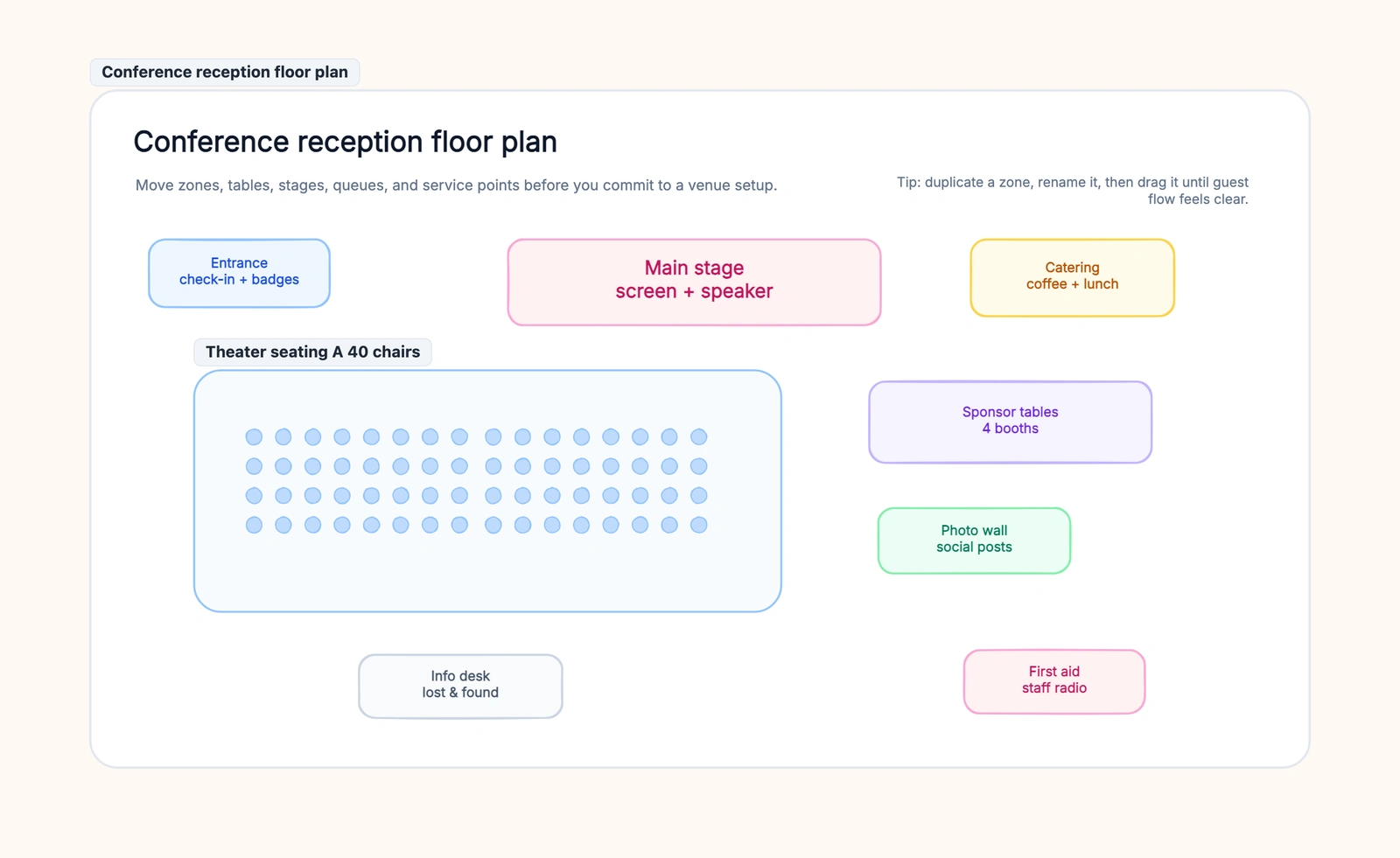
A conference reception usually revolves around check-in, a main stage, seating, catering, and sponsor visibility. An outdoor community event is more about food queues, activity zones, rest areas, safety points, and weather backup. A trade show depends on booth blocks, demo theaters, storage, meeting pods, and a visitor loop.
Write the format at the top of the board. Then list the three things guests must be able to find without asking:
- where to enter;
- where the main reason for attending happens;
- where to get help, food, water, or rest.
That short list keeps the layout from becoming a decorative map. The plan should answer real day-of questions.
Mark fixed points before movable zones
Every venue has fixed points. Mark them first:
- entrance and exit doors;
- emergency exits;
- restrooms;
- loading doors;
- elevators or stairs;
- power and water access;
- columns or walls that block movement;
- outdoor constraints such as slopes, trees, fences, or wet ground.
Once these are on the plan, you can place everything else around them. If you design the perfect sponsor area and later realize it blocks a fire exit, you have to redraw half the plan. Fixed points are boring, which is exactly why they should come first.
For outdoor events, add one more fixed layer: sun, shade, wind, rain, and vehicle access. A food truck zone that looks fine on a map can fail if the queue sits in direct sun or the truck cannot enter without crossing pedestrian flow.
Place the main attraction
The main attraction might be a stage, keynote area, demo theater, central installation, ceremony space, or activity field. Put it where guests can see it, where sound or visibility works, and where it does not block the path to everything else.
For seated events, leave a clear relationship between the stage and seating. Guests should not have to twist sideways to see the speaker. For trade shows, place demos so they draw traffic through the hall rather than trapping people near the entrance. For outdoor events, put the activity zone where there is enough open space around it, not just enough space for the activity itself.
One useful test: draw a simple path from entrance to main attraction. If it crosses food queues, storage, backstage, or sponsor furniture, the layout is asking for congestion.
Add guest flow, not just zones
Many event floor plans show what exists but not how people move. That is where problems hide.
Draw the likely paths:
- arrival path: entrance → check-in → first destination;
- program path: seating → stage → breakout or demo area;
- service path: catering → seating or lounge;
- support path: staff/storage → stage/vendor areas;
- emergency path: any point → exit or first aid.
The paths do not need to be beautiful. They need to reveal conflicts. If the coffee queue crosses the line to the keynote seats, move the coffee. If the vendor loading path crosses guest arrival, separate the timing or the route. If first aid is hidden behind sponsor booths, move it to an edge where staff can reach it quickly.
The event floor plan template includes three starting scenes — conference reception, outdoor event, and trade show — so you can test these paths with zones already on the board.
Give queues their own space
Queues are part of the layout, not an accident that happens later. Any area where people stop needs a queue or waiting buffer:
- check-in;
- coffee or lunch;
- food trucks;
- restrooms;
- coat check;
- demo signup;
- sponsor giveaways;
- ticket scanning;
- security.
Draw the queue as a real zone. If there is no room for it, the queue will use the aisle. That is the easiest way to turn a good event into a blocked event.
For food trucks or buffets, place queues parallel to the edge of the event rather than straight across a path. For check-in, avoid putting the first table too close to the door; guests need room to enter before they stop.
Add support zones early
Support zones are easy to forget because they are not the headline. They are also what saves the event when something goes wrong.
Add these before the plan feels finished:
- info desk;
- first aid;
- staff check-in;
- storage for boxes, swag, signs, and cables;
- vendor loading or staging;
- waste and recycling;
- water station;
- quiet or rest area;
- lost and found.
Support zones should be visible enough for staff, but not always in the center of guest attention. First aid belongs near an edge with access. Storage belongs near staff routes, not in the middle of the attendee path. The info desk should be findable from the entrance.
Review the floor plan by walking it
Once the first draft is drawn, walk through it as different people:
- a guest arriving five minutes before the keynote;
- a speaker trying to reach the stage;
- a caterer restocking coffee;
- a sponsor carrying boxes;
- a volunteer sending someone to first aid;
- a guest trying to leave during a crowded moment.
This role-based review catches issues a generic checklist misses. A layout may be fine for guests and terrible for staff. Or it may work at 10 a.m. but fail at lunch because the food line grows across the aisle.
Common mistakes
The most common mistake is treating the floor plan as a furniture map. Furniture matters, but flow matters more. A room with fewer tables and clean movement usually feels better than a room that maximizes every square foot and traps people in bottlenecks.
Another mistake is placing all popular zones together. Check-in, coffee, sponsor giveaways, and restrooms all draw people. Spread them out unless there is a strong reason not to.
Teams also forget storage. Boxes, signage, swag, spare badges, AV cases, and vendor supplies do not disappear. If they are not assigned a place, they end up under tables, behind curtains, or in staff walkways.
Finally, do not use a concept floor plan as a compliance drawing. Once the layout is agreed, hand it to the venue or production team for exact dimensions, fire-code checks, accessibility routes, and technical execution.
Free event floor plan template
Use the event floor plan template when you want a quick editable starting point instead of a blank canvas. Choose the scene closest to your event, rename the zones, drag them into your venue shape, and share the board with stakeholders.
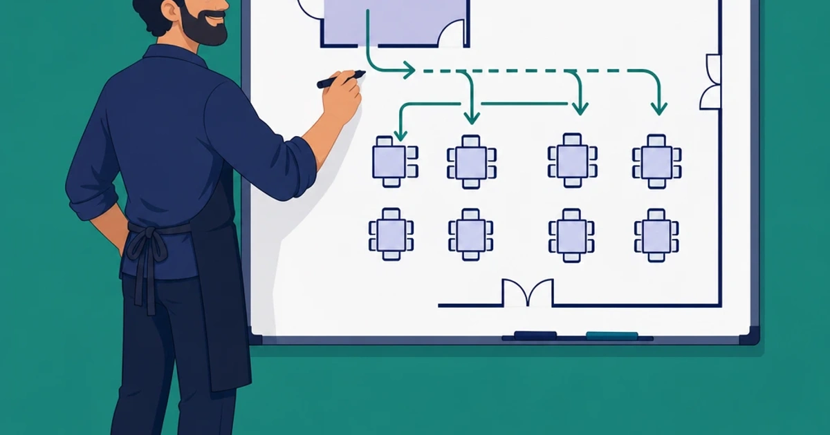
If your event is mostly assigned guest seating, the wedding seating chart template may be a better starting point. If food service and dining-room flow are the main challenge, use the restaurant floor plan template.
The best floor plan is not the prettiest one. It is the one that lets a tired guest, a busy server, a sponsor, and a volunteer all understand where to go.