A value stream map is not something you draw from a conference room. It is a picture of what actually happens between a customer request and delivery, and the only reliable way to get that picture is to walk the flow and write down what you see. People who try to build one from memory end up with a tidy diagram that hides the real delays.
This guide walks through how to create a value stream map from the floor up: choosing the product family, drawing the material and information flow, collecting time data, marking inventory, building the lead-time ladder, and turning the current state into a future state.
Pick one product family before you start
The most common reason a value stream map gets messy is scope. If you try to map every product your factory, team, or warehouse touches, the map becomes a tangle of lines and exceptions.
Choose a single product family — a group of items or requests that follow roughly the same sequence of steps. In manufacturing that might be one part number or a family that shares machines. In software it might be one kind of request, like a bug fix or a feature, rather than everything the team ships. In an e-commerce operation it might be one order type, such as domestic standard orders instead of all channels at once.
Once the family is picked, define the start and end. The start is where the process takes responsibility, and the end is where the customer receives value. Everything in between is what you are about to draw.
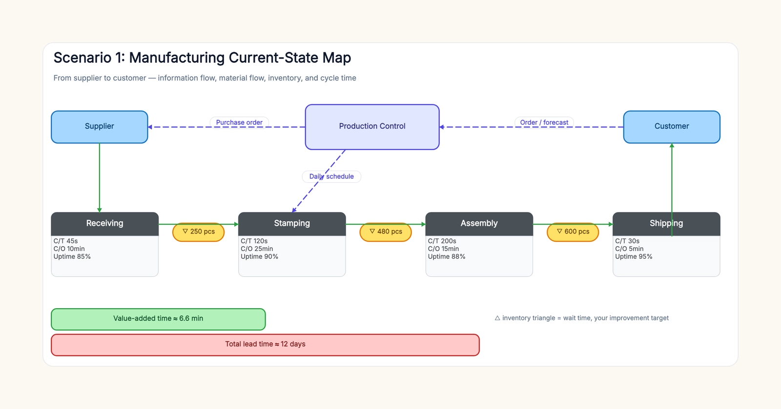
The value stream map template includes manufacturing, software delivery, and e-commerce scenes so you can start from a structure that already has the right bones.
Walk the process and draw the material flow first
Start at the customer end and walk backward, or start at the front and walk forward — either works as long as you trace every step by actually standing next to it.
Draw the material flow first. In manufacturing, this is the physical path a part takes: receiving, stamping, assembly, shipping. In software, the material flow is the work item moving from idea to backlog to code to test to deploy. In order fulfillment, it is the order moving from pick to pack to ship.
Write one box per process step, not one box per machine or one box per person. A "process" is a place where the product or work item stops and something changes. If nothing changes, it is not a process step — it is storage or waiting, and you will capture that separately.
Keep the boxes in a straight line and leave room between them. You are going to need that space for inventory and the lead-time ladder underneath.
Add the information flow on top
The information flow is what tells the work when to move. In manufacturing it is orders, forecasts, and schedules. In software it is tickets, requirements, and priorities. In fulfillment it is the order itself plus the shipping instructions.
Draw these as a separate layer above the material flow, using dashed lines so the reader can tell them apart from the solid material lines. Ask a simple question at each step: how does this process know what to make, for whom, and when? The answer is usually an arrow from a planning function or a customer to the process box.
Many maps skip this layer because the material flow feels more concrete. But waiting is almost always caused by the information flow — a schedule that does not arrive, a forecast that changes, a ticket that sits unassigned. Leave it out and you will not find the delay.
Collect cycle time, changeover, and uptime for each step
Under every process box, record three numbers: cycle time, changeover time, and uptime.
Cycle time is how long one unit takes at that step once the work starts. Changeover time, or setup time, is how long it takes to switch the step from one type of work to the next. Uptime is the share of available time the step is actually running, not broken down or idle.
Collect these by timing the process, not by trusting the ERP numbers. Watch a few units move through, use a stopwatch, and average what you see. The numbers people quote in meetings are often closer to what they wish were true than what is happening.
One trap is recording only cycle time. Cycle time tells you how fast a step can work; it says nothing about how long work sits in front of the step. You need the other two numbers, plus the inventory, to see the full picture.
If a step has multiple people or machines doing the same work, time the step as a whole rather than a single operator. What matters is how fast work moves through that process box, not how busy any one person looks while they wait for the next unit to arrive.
Mark inventory and waiting between steps
Between most process steps, work piles up. In manufacturing that is inventory. In software it is the backlog and the queue in front of a team. In fulfillment it is pallets waiting to be picked or packages waiting for a truck.
Mark every one of these with a triangle or a small labeled marker, and write the amount and the time it represents. A pile of 250 parts is not just a number — it is roughly 250 units of waiting that you can convert into days by comparing it against the customer demand rate.
The point of the marker is not to shame anyone. It is to make the waiting visible so you can measure it against the work itself. On the value stream map template, these markers sit directly on the material flow line between process boxes.
Build the lead-time ladder at the bottom
Now draw the part that turns a picture into a diagnosis: the lead-time ladder.
Make two bars at the bottom of the map. The short bar is value-added time — the sum of all the cycle times. The long bar is total lead time — the time from order to delivery. The gap between the two bars is the waiting and non-value-added time.
A typical manufacturing map shows a value-added time measured in minutes and a lead time measured in days. That gap is the story. When the value-added time is six minutes and the lead time is twelve days, no amount of speeding up a single machine will fix the delay. You have to attack the waiting.
This comparison is why you collected real numbers in the first place. If the ladder uses guessed numbers, it will tell you a comfortable story that does not match the customer's experience.
Turn the current state into a future state
The current-state map is not the deliverable. The future-state map is.
Look at the current map and find the biggest chunk of waiting. Ask what would have to change to cut it: smoother scheduling so work does not sit, smaller batches so inventory does not pile up, or a faster handoff from the information flow to the material flow.
Draw the future state as a new map with the improvements applied, then plan the concrete changes that get you from one to the other. A future-state map that just removes the inventory triangles without changing how work is triggered is a wish, not a plan.
Common mistakes that make a value stream map useless
The first mistake is drawing the map from a procedure document instead of the floor. Procedures describe how the process should work; the map needs to show how it actually works, including the informal workarounds people use to keep things moving.
The second mistake is leaving out the information flow. If the map has no dashed lines, it is a process flowchart wearing a value stream costume, and it will miss the scheduling delays that cause most of the waiting.
The third mistake is guessing the time data. Real value stream mapping depends on timed observations. When a team guesses, the lead-time ladder shows whatever makes the process look reasonable, and the exercise produces a poster instead of an improvement.
Finally, do not stop at the current state. The map earns its keep when it leads to a changed future state and a short list of next actions. A map that sits on a wall and changes nothing was a nice drawing, not a value stream map.
Free value stream mapping template
Open the value stream map template and choose the scene closest to your situation: manufacturing, software delivery, or e-commerce fulfillment. The manufacturing example deliberately separates dashed information flow from solid material flow, so keep those two layers when you replace the process names, measured cycle times, changeover, uptime, and inventory.
For a simpler sequence without the time metrics, start with the process map template. To capture suppliers, inputs, outputs, and customers before you map the flow, use the SIPOC diagram template.
A value stream map does not make the work faster on its own. It makes the waiting visible enough that you can finally do something about it.