The best value stream mapping examples are not pretty diagrams of an ideal process. They show a real item moving through a real system, including the waits that people normally explain away. That is why a map can reveal a striking result: a product may receive only minutes of hands-on work while taking days or weeks to reach a customer.
The four examples below use the same core question: where does the customer-facing item wait, why does it wait, and what evidence would show that the delay has actually improved? Open the value stream map template to adapt the manufacturing, software, or fulfillment scenes while you read.
Example 1: Manufacturing current-state map
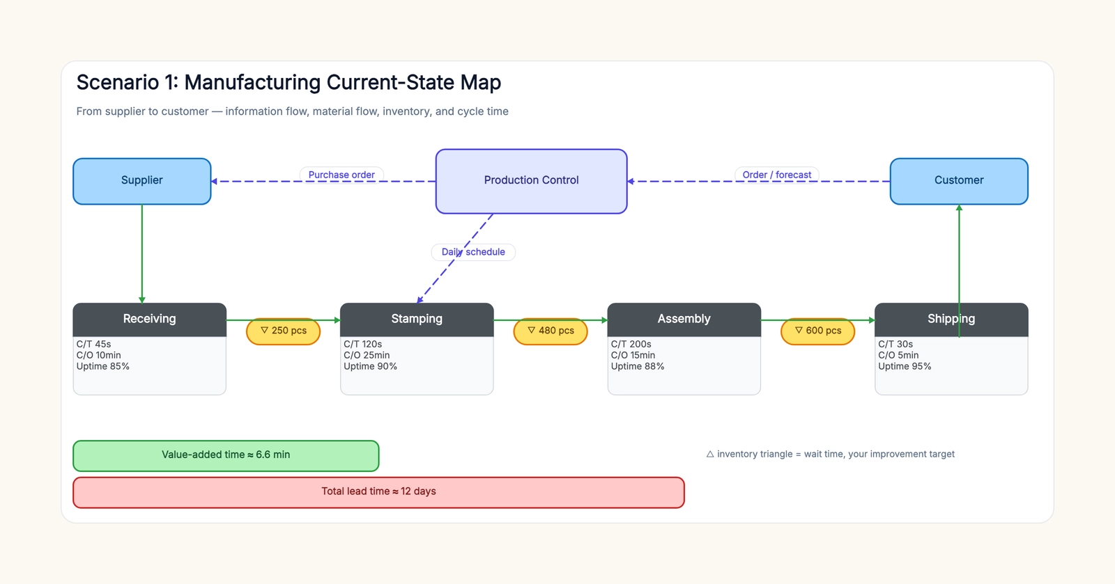
Imagine a metal component moving through receiving, stamping, assembly, and shipping. A useful map shows the supplier and customer at the edges, production control above the process, and each physical operation in a horizontal line. Beneath every operation, place a data box: cycle time, changeover time, and uptime. Between operations, use inventory triangles with an observed quantity or days of stock.
The important comparison is not whether stamping is slower than assembly. It is the ratio between value-added time and total lead time. A map might show 45 seconds at receiving, 120 seconds at stamping, 200 seconds at assembly, and 30 seconds at shipping—less than seven minutes of processing—while inventory and scheduling waits produce twelve days of lead time.
That gap tells the team where not to start. Shaving ten seconds from assembly may matter less than reducing a five-day queue before it. The information flow often explains the queue: a weekly schedule, a batch release rule, or a forecast that does not match actual demand. Mark those instructions as dashed lines above the material flow so the map shows both the work and the reason it waits.
Example 2: Software delivery value stream
Software teams often map activity rather than flow: planning, coding, testing, and deployment all look busy. A value stream map instead follows one work item from idea to a customer-visible release. A simple current state may be idea → backlog → development → test → deploy → customer.
Put a wait label between stages. A feature could wait three days for prioritization, five days in backlog, two days for test capacity, and one day for a release window. The development work might take four days in total, while the request spends sixteen days in the system. That is not an argument to rush testing; it is evidence to investigate why work is released into a queue before it can be pulled.
For this example, track work age, queue size, rework, deployment frequency, and the rule that moves a ticket to the next stage. A future state might introduce smaller batch sizes, a pull limit, or an explicit service-level expectation for review. The map is successful only if the team can compare the same measurements after the change.
Example 3: E-commerce fulfillment
In e-commerce, a value stream can start when a paid order is released and end when the customer receives it. The physical path is clear—pick, pack, ship, carrier delivery—but the waits are often hidden inside cut-off times, batch waves, labels, and carrier handoffs.
Map the order release signal above the flow, then record the time or queue between pick and pack, pack and handoff, and handoff and delivery. A common discovery is that picking takes minutes, packing takes minutes, and the largest variable is the order waiting for the next carrier collection. The improvement is not “make pickers work faster”; it may be moving the cutoff, changing wave design, or creating an exception route for high-priority orders.
Do not mix carrier transit time with internal handling without labeling it. The customer experiences the whole lead time, but the operation needs to distinguish what it controls from what it can only monitor and escalate.
Example 4: Service request flow
The item in a service value stream can be a maintenance request, insurance claim, patient referral, or grant application. Take a maintenance request: it arrives, is triaged, assigned, scheduled, completed, verified, and closed. The map should include the request signal, queue at triage, time awaiting customer access, vendor scheduling delay, repair time, and confirmation time.
The most valuable improvement may be a better intake form that routes emergencies immediately, not more reminders after a request is already stuck. Service maps work when they preserve human judgment: automate a receipt, task assignment, or reminder if useful, but keep safety, fairness, and exception decisions with a named owner.
How to read any example without copying it blindly
First, define one item family. Do not map every product, ticket, or customer type together. Next, walk the actual route and collect observations from the work, not from a procedure document. Third, separate processing time from waiting time. Finally, select one hypothesis to test, such as reducing batch size or making an approval rule explicit.
Avoid a future-state map that contains only improvements. Keep one measurable target beside each proposed change: queue size, wait days, first-pass yield, or lead time. Review it after a defined period and update the map with what actually happened.
Build your own example
Start with the scenario closest to your work in the value stream map template. Replace the process names with your own, add observed queue sizes and times, and draw the information signal that tells each step to begin. If the map does not make waiting visible, it is probably a process flowchart—not yet a value stream map.