Most About Me pages are either a copy-pasted LinkedIn summary or three sentences that say almost nothing. "Passionate about building great products." "Loves solving hard problems." These phrases appear on millions of pages and convince no one.
A good About Me page does something specific: it helps a stranger decide, in under a minute, whether you are the kind of person they want to hire, book, or collaborate with. It is not your life story. It is not your resume reformatted as prose. It is a focused argument for why someone should take the next step with you.
Here is how to write one that actually works — with a structure you can copy, versions tailored to different professions, and the mistakes that make most About pages forgettable.
The Three-Question Framework
Every effective About Me page answers three questions, usually in this order:
Who are you? A one-sentence positioning statement. Not your job title — your value. "I help early-stage SaaS startups design onboarding flows that convert" is stronger than "I'm a UX designer."
What have you done? Proof that you can deliver. This can be years of experience, notable projects, clients you have worked with, or specific results. Numbers help: "3 products, 200K users" lands harder than "shipped several products."
Why should I take the next step? A clear, low-friction action. "Browse my projects," "Book a 15-minute call," or "Email me at [email protected]." If the reader finishes your page and does not know what to do next, the page has failed.
Everything else — your origin story, your values, your hobbies — supports these three answers. If it does not, it is filler.
A Copyable About Me Page Structure
Here is a structure you can adapt. Each section is optional — include what serves your audience and skip the rest.
1. Positioning statement (1–2 sentences). Who you are, who you serve, what makes you different. Put this at the top — it is the first thing people read.
2. Brief professional narrative (3–5 sentences). How you got here and what you care about. Avoid the chronological resume dump. Instead, connect the dots: "I started in QA, which taught me that most bugs are actually design problems. That led me to UX, where I have spent the last six years."
3. Credentials or social proof (bullet points or a short grid). Years of experience, notable companies or clients, publications, talks, awards, education. Keep this scannable — nobody reads a wall of text.
4. What you do now (1–2 sentences). A concrete, present-tense statement about your current work. "Right now I am building the design system at Acme, and I write about component architecture on the side."
5. A little personality (1–2 sentences). Something human. Where you live, what you do outside work, a surprising fact. This is what makes a page memorable — but keep it brief. One interesting detail beats a list of five hobbies.
6. Next step (a link or CTA). This is not optional. "See my work," "Get in touch," "Read my writing" — pick one primary action and make it the obvious next click.
Copyable About Me Page Examples
Templates are easiest to use when the first draft is already half-written. Use these examples as starting points, then swap in your own proof, audience, and next step.
Developer portfolio example: "I build reliable web applications for small product teams. Over the last five years, I have shipped dashboards, billing flows, and internal tools used by operations teams every day. My work usually sits where product design meets backend constraints: turning messy workflows into interfaces that people can actually finish. Recent projects include a customer support console, a usage-based billing system, and a migration from a legacy admin panel to a faster React application. If you are hiring for product engineering work, start with my projects or send me a note."
Freelance service example: "I help B2B software companies explain technical products without making readers feel lost. My work includes API guides, onboarding tutorials, launch pages, and long-form technical articles. Clients usually come to me when the product is powerful but the story is hard to follow. I turn product knowledge into content that developers can scan, trust, and use. If you need a clearer docs hub or launch narrative, book a short call and I will help you map the first version."
Student or early-career example: "I am a computer science student interested in human-centered software. My projects combine frontend development, accessibility, and small experiments with data visualization. I am currently looking for internships where I can learn from a strong engineering team and contribute to real product work. This site collects the projects, notes, and coursework that show how I think. Start with the campus events app — it is the best example of how I approach user problems."
Notice the pattern: each version is specific. It names the audience, shows proof, and ends with a clear action. You do not need a dramatic life story. You need enough context for the right visitor to say, "Yes, this person fits what I need."
If you want to plan where these paragraphs belong on the page, pair this writing structure with the portfolio website wireframe template before you start polishing copy.
Professional Versions
Different professions need different angles. Here is what to emphasize in each:
Developer: Lead with what you build and for whom. "I build backend infrastructure for fintech startups. Currently focused on Go and distributed systems." Follow with a skills section organized by category (languages, frameworks, tools) rather than a flat list, and link to projects that demonstrate each skill in context. Developers often undersell their impact — use numbers where you can ("migrated 500K users with zero downtime").
Freelancer: Your About page is also your sales page. Lead with the problem you solve and who you solve it for. "I write technical content for developer tools companies — API docs, tutorials, and thought leadership that engineers actually want to read." Include a services section, client logos or testimonials, and a clear booking CTA. Freelancers should also include a process overview — 3–4 steps that show what it is like to work with you.
Designer: Show, do not just tell. Your About page should link to your best work early — ideally by the second paragraph. Lead with your design philosophy or approach ("I design interfaces that feel obvious, not clever") rather than a tool list. A tool list is fine in a sidebar, but nobody hires a designer because they know Figma.
Academic: Lead with your research area and current position. Follow with a clearly labeled Publications section (reverse chronological, with PDF/DOI links). Include Teaching and a short News section for recent talks, grants, or awards. Academic pages benefit from being skimmable — clear headings, clean typography, no visual clutter.
Career changer: Lead with the narrative. "After eight years as a mechanical engineer, I moved into software because I wanted to build things that ship in hours, not months." Connecting your past career to your current one shows the throughline. Emphasize transferable skills and recent projects that prove you can do the new job.
Common Mistakes
Writing for everyone. An About page that tries to appeal to recruiters, clients, collaborators, and conference organizers simultaneously ends up appealing to none of them. Pick one primary audience and write for them. You can always add a secondary page or section for other audiences later.
Leading with your job title. "Senior Product Manager at Acme Corp" tells a reader where you work. It does not tell them why they should care. Put your title in a sidebar or footer — lead with the value you create.
Hiding the next step. Too many About pages end with the last paragraph of the story and nothing else. Always end with an action: a link, a button, an invitation. "See my work" is worth more than any closing sentence.
Using jargon no real person uses. "Leveraging synergistic cross-functional methodologies to drive value-add outcomes" makes readers click away. Write like you talk. Read your draft out loud — if you would not say it to someone over coffee, rewrite it.
Forgetting to update. An About page that says "currently learning React" when you have been writing React for three years signals neglect. Set a calendar reminder to review your About page every six months.
Plan Before You Write
Most people open a text editor and stare at a blank page. There is a better way: plan the structure visually first.
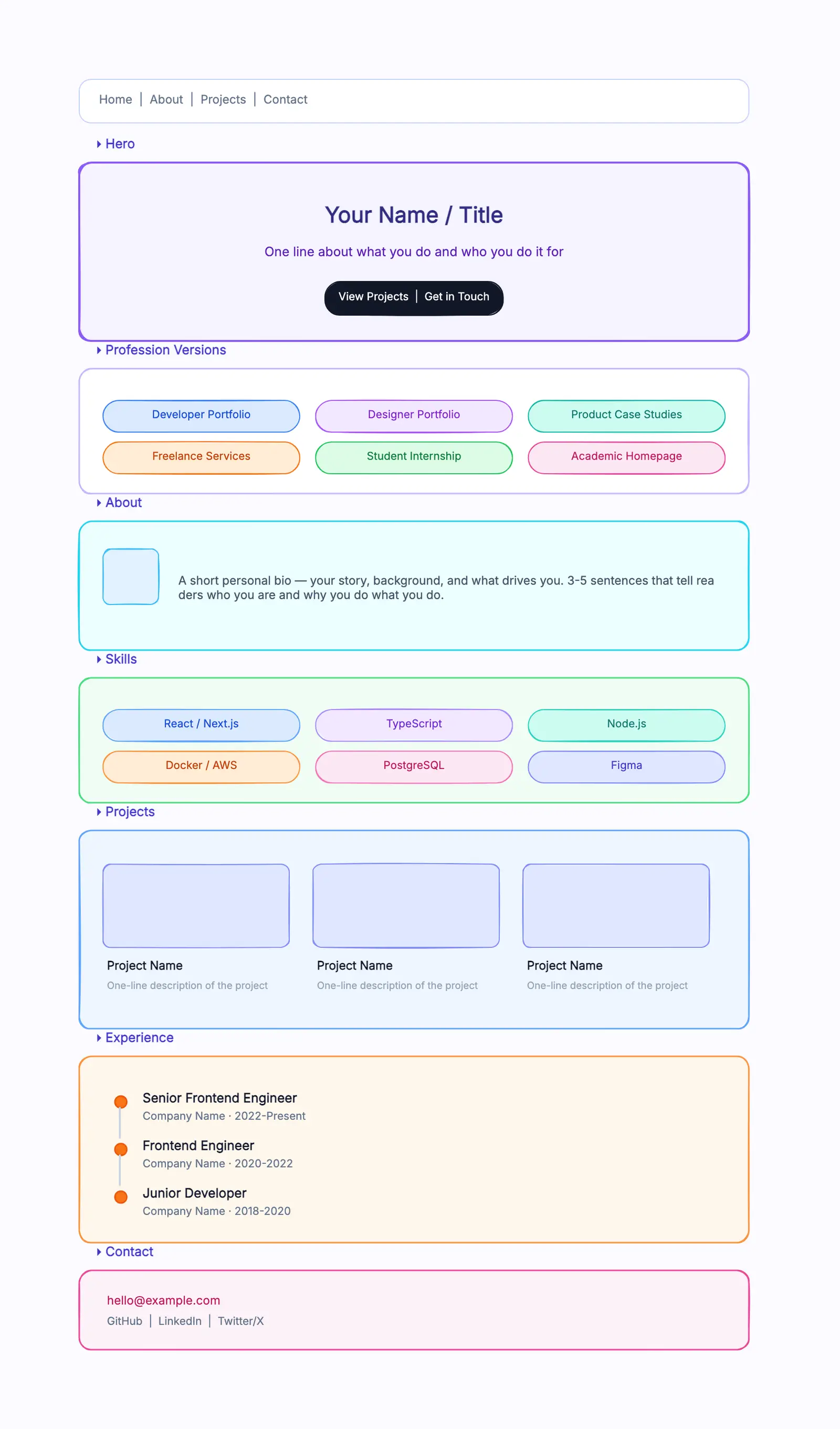
Before writing a single sentence, use a wireframe to map out the sections of your personal site. Where does the About content sit relative to your project gallery and contact form? How much space does each section need? A portfolio website wireframe template lets you block out the layout — Hero, About, Skills, Projects, Contact — and see the whole page at a glance before committing words to it.
CodePic is a free, hand-drawn-style whiteboard where you can plan page layouts visually. It is not a website builder — it is a thinking tool for figuring out what goes where before you build the real thing. Start with the portfolio wireframe template, customize the sections to match your story, and write your About content into a structure you have already validated.
Once you have the layout, the writing becomes easier — you are filling in a structure rather than inventing one from scratch.
Related Reading
- Portfolio Website Wireframe Template — Plan your personal site layout before building.
- Excalidraw Alternatives: The Best Hand-Drawn Whiteboard Tools — Tools for visual thinking and sketching.
- Best Free Online Whiteboard Tools in 2026 — Broader roundup of free whiteboard options.
- Miro vs FigJam (2026): Which Whiteboard Tool Fits Your Team? — When you need a team whiteboard.