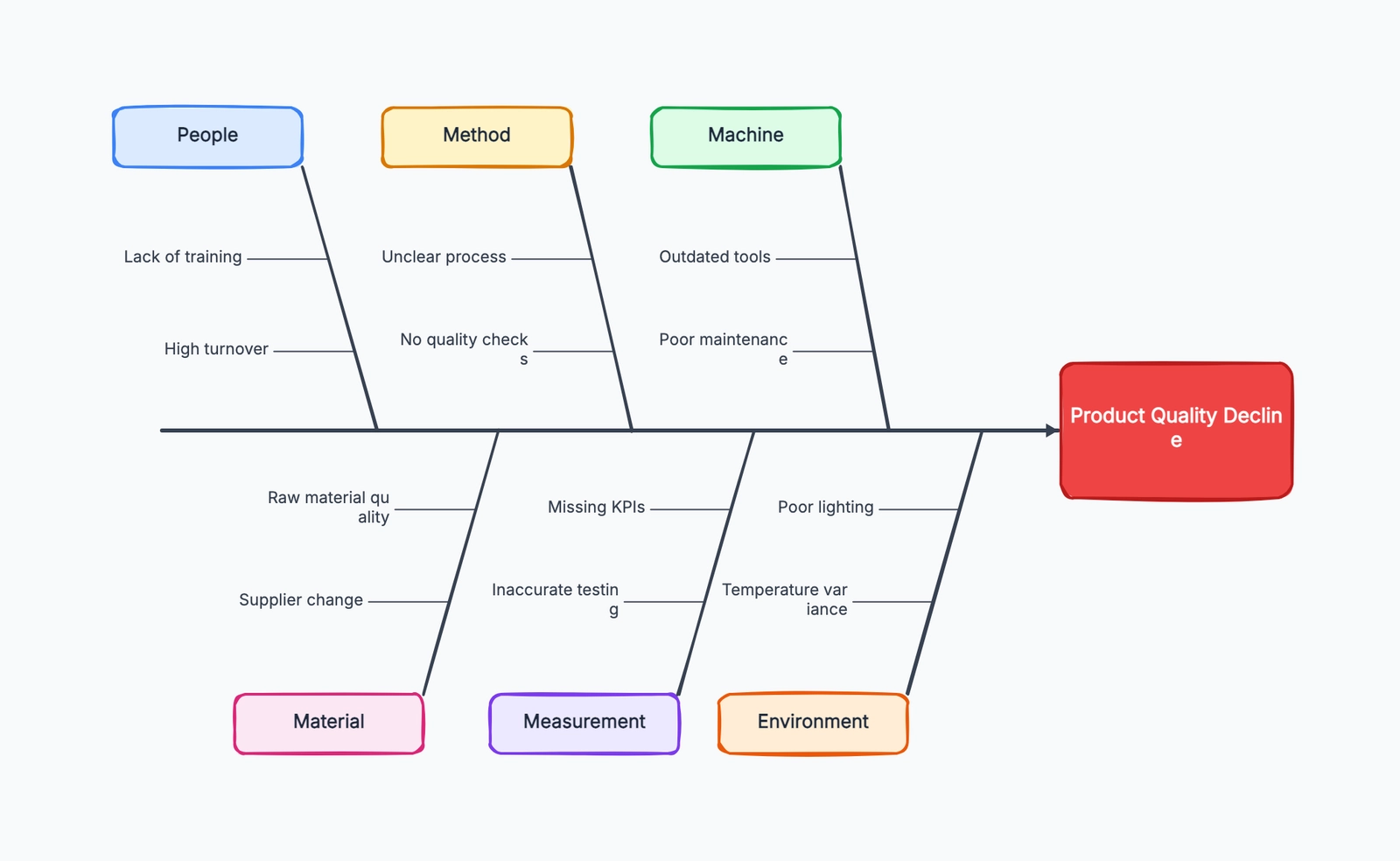
A fishbone diagram is a root cause analysis tool used to explore the possible causes of a specific problem. It is also called an Ishikawa diagram or a cause-and-effect diagram. The "fish head" names the problem you want to solve, the main bones group broad cause categories, and the smaller bones list possible contributing causes.
The format is simple, but the shift in thinking is important. Instead of jumping to the first explanation that sounds plausible, a fishbone diagram gives a team a structured way to ask: what system, process, environment, or decision could be creating this outcome?
Fishbone diagrams are common in manufacturing and quality management, but they are just as useful for product teams, support teams, operations, marketing, and engineering. Anywhere a problem has more than one possible cause, a fishbone diagram can help you slow down and investigate before choosing a fix.
Why Fishbone Diagrams Work
Most teams are tempted to turn problems into people problems. A product defect becomes "the operator made a mistake." A support backlog becomes "agents are not working fast enough." A drop in website conversion becomes "marketing sent bad traffic."
Sometimes individual behavior matters. But stopping there is risky because it often misses the system that made the behavior likely in the first place.
A fishbone diagram moves the conversation from blame to causes. It asks the team to look at the wider system: training, tools, materials, handoffs, measurement, environment, process design, and decision rules. The goal is not to find someone to blame. The goal is to understand why the problem was able to happen.
That matters because different causes require different fixes. If a defect comes from unclear work instructions, retraining one person won't solve it. If slow support responses come from poor ticket routing, asking agents to "try harder" only hides the real bottleneck.
The diagram also helps teams avoid one-cause thinking. A problem can have several contributing causes at once: a weak process, a measurement gap, a tool limitation, and a workload spike. Seeing those causes together makes it easier to choose a fix that matches reality.
Main Cause Categories
The most common fishbone structure uses the 6M categories, originally from manufacturing:
| Category | What It Covers |
|---|---|
| Man | People, skills, training, staffing, communication |
| Machine | Equipment, tools, software, hardware, maintenance |
| Method | Process steps, procedures, standards, workflows |
| Material | Inputs, parts, supplies, data, content, requirements |
| Measurement | Metrics, inspection, monitoring, feedback loops |
| Environment | Physical conditions, workload, market context, timing |
These categories are a starting point, not a rule. The purpose is to make sure the team looks broadly enough.
For service businesses, software teams, and internal operations, a simpler set often works better:
| Category | Example Questions |
|---|---|
| People | Do people have the skills, context, authority, and time they need? |
| Process | Are steps clear, sequenced well, and owned by the right team? |
| Technology | Are tools, systems, integrations, or automation causing friction? |
| Policy | Are rules, approvals, incentives, or constraints creating the problem? |
Choose categories your team understands. A fishbone diagram is useful only if the labels make people think of real causes, not if they sound theoretically correct.
Real-World Fishbone Diagram Examples
Product Defects
A manufacturing team sees a higher-than-normal number of scratched parts leaving the assembly line. The fish head is:
Problem: Scratched parts found during final inspection
Possible causes might include:
- Man: New operators have not been trained on handling procedures
- Machine: Conveyor guide rails are worn and touching the surface
- Method: Parts are stacked before protective film is applied
- Material: Protective film from a new supplier is thinner than usual
- Measurement: Scratches are only checked at the end, not earlier in the line
- Environment: Workstations are crowded during peak shifts
The diagram does not prove which cause is true. It gives the team a complete list to investigate. In this case, the real fix might involve both equipment maintenance and changing the sequence of the protective film step.
Slow Customer Support Response
A support team misses its first-response SLA for two weeks in a row. The fish head is:
Problem: First response time is above SLA
Using service categories, the team might identify:
- People: New agents are handling complex tickets too early
- Process: Urgent tickets are not separated from low-priority requests
- Technology: The help desk does not automatically route billing tickets
- Policy: Agents need manager approval before offering refunds
- Measurement: The dashboard shows daily averages, hiding morning spikes
Without the fishbone diagram, the team might only add more agents. After mapping causes, they may discover that ticket routing and approval policy are doing more damage than staffing.
Website Conversion Rate Decline
A growth team notices that trial signups dropped after a website redesign. The fish head is:
Problem: Trial signup conversion rate decreased
Possible causes include:
- People: Sales and marketing disagree on the primary audience
- Process: No one reviewed the signup flow after design changes
- Technology: The form loads slowly on mobile
- Policy: New required fields make the form longer
- Material: Page copy focuses on features instead of buyer problems
- Measurement: Analytics events changed, so old and new data are not comparable
This example shows why fishbone diagrams are useful outside quality control. A website metric can fall for design, technical, positioning, tracking, or traffic reasons. The diagram keeps the team from treating a measurement problem as a design problem too quickly.
How to Create a Fishbone Diagram
Step 1: Define the problem clearly. Write the problem in one specific sentence. "Customer support is bad" is too broad. "First response time for billing tickets exceeded 24 hours for the last 10 business days" is specific enough to investigate.
Step 2: Draw the fish head. Place the problem statement at the right side of the diagram. Draw a horizontal spine pointing to it. Everything you add should connect back to this one problem.
Step 3: Choose the main cause categories. Use 6M if you are working on manufacturing, quality, or physical operations. Use People, Process, Technology, and Policy if you are analyzing a service, software, or business process problem. Rename categories if local terms make the discussion clearer.
Step 4: Brainstorm possible causes. Ask the people closest to the work what could be contributing. Put every plausible cause on the diagram before judging it. The early goal is coverage, not certainty.
Step 5: Ask why repeatedly. For each cause, ask "why does this happen?" If the cause is "agents answer late," ask why. Maybe tickets are hard to triage. Why? Maybe the form does not capture issue type. Why? This is where the diagram starts moving from symptoms to root causes.
Step 6: Validate the likely causes. A fishbone diagram creates hypotheses. It does not replace evidence. Check data, observe the process, inspect logs, interview users, or run a small test before committing to a solution.
Common Mistakes
Defining the problem too broadly. If the fish head says "quality issues" or "poor customer experience," the diagram will become a catch-all list. Narrow the problem until the team knows exactly what outcome is being explained.
Listing symptoms as causes. "Customers are angry" may be real, but it is usually another effect, not a root cause. Ask what created that symptom: delayed replies, unclear pricing, broken onboarding, or mismatched expectations.
Skipping validation. A fishbone diagram can make guesses look organized. That does not make them true. The strongest diagrams lead to investigation, not instant decisions.
Only letting managers fill it in. Managers often know the process design, but not the daily workarounds. Include people who do the work, handle exceptions, talk to customers, maintain the tools, or inspect the output.
Forcing every cause into a category. Categories are there to help thinking, not to win an argument. If a cause does not fit neatly, write it down anyway and clean up the diagram later.
Fishbone Diagram vs. Other Problem-Solving Tools
| Tool | Best For | How It Differs |
|---|---|---|
| Fishbone diagram | Exploring many possible causes of one problem | Broad cause mapping before choosing where to investigate |
| 5 Whys | Drilling deeper into one likely cause | Linear questioning; works best after a cause area is selected |
| Flowchart | Understanding how a process moves step by step | Shows sequence and handoffs, not cause categories |
| Risk matrix | Prioritizing risks by likelihood and impact | Helps rank risks, but does not explain root causes |
| Pareto chart | Finding the biggest contributors in measured data | Shows which categories matter most when you already have counts |
These tools often work together. Use a Pareto chart to identify the most frequent defect type, a fishbone diagram to explore why it happens, 5 Whys to dig into the most likely branch, and a flowchart to redesign the process if the root cause is procedural.
Frequently Asked Questions
What is a fishbone diagram used for? A fishbone diagram is used to identify and organize possible causes of a specific problem. It is most useful when the problem has several possible contributors and the team needs a structured way to investigate.
Why is it called a fishbone diagram? The diagram looks like a fish skeleton: the problem sits at the head, a main line forms the spine, and cause categories branch out like bones.
Is a fishbone diagram the same as an Ishikawa diagram? Yes. "Fishbone diagram," "Ishikawa diagram," and "cause-and-effect diagram" usually refer to the same tool.
What are the 6M categories in a fishbone diagram? The 6M categories are Man, Machine, Method, Material, Measurement, and Environment. They are common in manufacturing and quality improvement, but teams can use other categories when they fit better.
Do fishbone diagrams find the root cause automatically? No. They help teams generate and organize possible causes. You still need evidence to confirm which causes are real and which fixes will work.
What software can I use to make a fishbone diagram? You can use a whiteboard, diagramming tools like draw.io, or start with CodePic's fishbone diagram template. For team workshops, choose a tool that makes it easy to add, move, and group causes quickly.