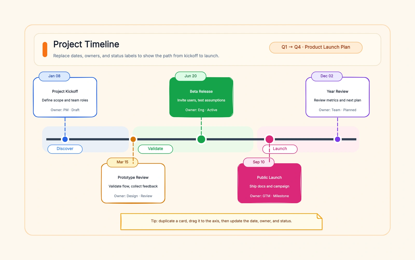
A project timeline template for Excel is the fastest way to turn a list of milestones into a visual timeline when your data is already in a spreadsheet. You don't need a dedicated timeline tool for every project — if your milestone list lives in Excel, you can build a clean, auto-updating timeline chart in about 10 minutes.
This guide walks through the step-by-step process, from setting up your data table to formatting a chart that's presentable enough for a status report. Includes formatting tips, common pitfalls, and a clear answer on when Excel is the right tool and when you should switch to a dedicated timeline maker.
Fastest Visual Option: Start in CodePic, Keep Excel for the Data
If your timeline needs to look good in a report or stakeholder deck, use Excel as the source of truth for dates and CodePic as the visual layer. Keep the milestone table in Excel, then open the editable project timeline template, paste the milestone names and dates into the canvas, and export a clean PNG or SVG. You get the reliability of a spreadsheet without fighting chart formatting for every label.
This is especially useful when the milestone list is already approved but the chart still looks like a default spreadsheet. Excel remains the planning file; CodePic becomes the presentation-ready version.
When to Use Excel for a Project Timeline
Excel timelines work best in three situations:
Your data is already in Excel. The biggest advantage: no export, no import, no copy-paste. Your milestone list updates, the chart updates. This alone saves more time than any dedicated tool can make up.
You need a simple, single-track timeline. 5-15 milestones, one line, no branching. Excel handles this well. Once you go beyond 15 events or need parallel tracks, the chart gets crowded and you're fighting the tool.
The audience expects a spreadsheet. Some stakeholders want an .xlsx file they can open, edit, and send back. A timeline in Excel stays in their workflow. Exporting a PNG from a timeline tool and pasting it into Excel breaks that loop.
Excel is the wrong tool when: you need a timeline that looks designed (use Canva or Visme), you need interactive or branching timelines (use Preceden or Miro), or the timeline will be presented in a high-stakes meeting where visual polish matters (use a dedicated timeline maker and export to PNG).
Step-by-Step: Build a Project Timeline in Excel
Step 1: Set Up Your Data Table
Create a table with three columns:
| A: Milestone | B: Date | C: Plot Order |
|---|---|---|
| Project kickoff | 2026-01-15 | 1 |
| Requirements signed off | 2026-02-10 | 2 |
| Design complete | 2026-03-05 | 3 |
| Development starts | 2026-03-20 | 4 |
| Beta release | 2026-05-01 | 5 |
| V1.0 launch | 2026-06-15 | 6 |
Column C (Plot Order) is the trick most people miss. It controls the vertical positioning of each milestone bar. Use sequential numbers (1,2,3...) for a simple stacked layout, or use the same number for milestones that should appear on the same row.
Format column B as Date — Excel needs to recognize these as dates for the chart axis to work properly. Don't use text like "January 2026."
Step 2: Insert a Horizontal Bar Chart
Select the Milestone and Date columns (A and B). Go to Insert → Charts → Bar Chart → Stacked Bar.
You'll get a chart with horizontal bars. Each bar represents the number of days from Excel's date origin (Jan 1, 1900) to your milestone date. This looks wrong but it's correct — we'll fix the axis in the next step.
Step 3: Fix the Axis and Bar Order
Right-click the vertical axis → Format Axis → check "Categories in reverse order." This puts your earliest milestone at the top and latest at the bottom — the natural reading order for a timeline.
Now format the horizontal axis: right-click → Format Axis → set the Minimum bound to your project start date (Excel converts it to a number — that's fine). Set the Major unit to 30 (days) for monthly spacing, or 7 for weekly.
Step 4: Add Milestone Labels and Clean Up
Remove chart elements that add noise: delete the legend (your bars don't need one), remove gridlines or set them to a very light grey, and delete the chart border.
Add data labels: right-click a bar → Add Data Labels → Format Data Labels → check "Category Name" and "Value." Format the Value as Date so it shows the actual date instead of the serial number.
Step 5: Format for Readability
Make all bars the same colour (a muted blue or grey), except for the most important milestone — the launch date, a key decision point, or "today." That one bar gets an accent colour. This gives readers an instant visual anchor.
Set the chart title to your project name and timeline period. Adjust the bar height (right-click bars → Format Data Series → reduce Gap Width to 50-80%) so they're thick enough to read labels on.
Common Pitfalls When Making Excel Timelines
Skipping the "categories in reverse order" step. Your timeline will read bottom-to-top instead of top-to-bottom. It's a small checkbox that makes or breaks readability.
Using text dates instead of actual dates. If Excel doesn't recognize your dates, the chart axis won't scale properly and you'll get a bar chart of equal-length bars — useless for a timeline.
Adding too many milestones. Past 15 events, the labels overlap and the bars become unreadably thin. Split long timelines into phases, or switch to a vertical layout (which Excel can do with a bit more setup).
Leaving the default chart formatting. The default Excel bar chart has a border, heavy gridlines, a legend, and garish colours. Spend 2 minutes cleaning it up — the difference between "obviously a spreadsheet chart" and "a timeline I can put in a status report."
Excel vs Dedicated Timeline Tools
| Excel | Dedicated Timeline Tool | |
|---|---|---|
| Setup time | 10 min (if data exists) | 5-30 min depending on tool |
| Auto-update | ✓ (chart linked to data) | Depends on tool |
| Visual quality | Functional | Usually better |
| Collaboration | Via shared workbook | Real-time in most tools |
| Branching / parallel tracks | Difficult | Easy in most tools |
| Export formats | .xlsx, PDF | PNG, PDF, SVG, embed |
| Best for | Internal reporting, data-heavy timelines | Presentations, client-facing deliverables |
If the timeline stays internal and the data is already in Excel, build it there. If the timeline is going to a client, exec, or conference presentation, draft it in Excel first (to get the data right), then rebuild in a dedicated tool for the visual polish.
Free Templates and Next Steps
The fastest way to a working Excel timeline: open a blank workbook, paste in your milestones and dates, and follow the 5 steps above. You'll have a functional timeline in 10 minutes and you'll understand how every piece works — which means you can customize it later without Googling "how to fix Excel timeline chart."
For more timeline template options, see our main guide on free project timeline makers and templates, which covers Excel, PowerPoint, Google Sheets, and Word templates side-by-side.
If you want a ready-made timeline that's faster than building a chart from scratch, grab our timeline template — opens in the browser, pre-configured with a hand-drawn style, exports to PNG with no watermark or signup.
Related Reading
- Free Project Timeline Maker: 7 Tools + Templates Compared — The main timeline pillar with full tool comparisons
- Project Timeline Template PowerPoint: Beyond SmartArt — When the timeline needs to go into a deck
- Project Timeline Template Google Sheets: Collaborative + Free — Real-time collaborative alternative to Excel
- Simple Project Timeline Template: Clean, Fast, No Fuss — A lighter approach when you just need milestones on a line