A line chart connects data points with a line so you can see how a value changes over time. It is the right choice whenever the story you want to tell is the trend — is it going up, going down, leveling off, or swinging back and forth? A table can give you exact numbers, but it hides that shape. A line chart shows it in one glance.
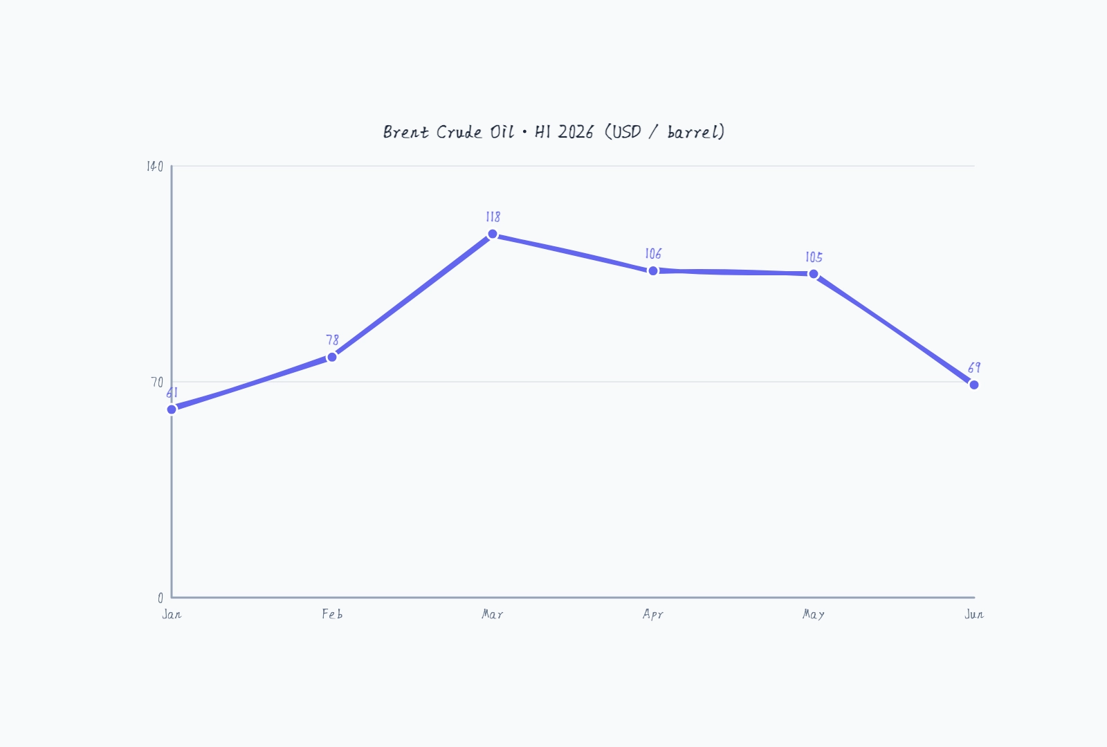
Take oil prices in the first half of 2026. Brent crude started the year around $61, spiked to $118 by March as conflict tightened supply, hovered just above $100, then dropped back below $70 once peace talks eased the pressure. Written as a row of numbers — 61, 78, 118, 106, 105, 69 — that's a forgettable sequence. Drawn as a line, the rise-and-fall is impossible to miss. That's the whole point of a line chart.
When to Use a Line Chart (and When Not To)
Reach for a line chart when:
- Your data is measured at regular intervals — by day, week, month, or year
- The order of the points matters and the change between them is meaningful
- You're tracking a single metric (or a few) over a continuous range
Pick something else when:
- You're comparing separate categories with no natural order — "sales by region" is a bar chart, not a line chart, because connecting Texas to California with a line implies a trend that doesn't exist
- You're showing parts of a whole — that's a pie or stacked chart
- You only have two or three points and a sentence would do
The quickest gut check: would drawing a line between the points mean something? For "revenue by month," yes — the slope is the growth rate. For "favorite ice cream flavors," no — there's nothing between vanilla and chocolate.
Step 1: Get Your Data in Order
A line chart needs pairs: a label (the x-axis category, usually a time period) and a value (the number you're plotting). List them out before you open any tool:
Jan: 61
Feb: 78
Mar: 118
Apr: 106
May: 105
Jun: 69
Two rules at this stage. First, keep the intervals consistent — all months, or all weeks, not a mix. Second, don't have too many points. Twenty labels crammed onto one axis become an unreadable smear; if your raw data is daily but the story is monthly, aggregate it first.
Step 2: Plot the Points and Connect Them
Each point sits at its label on the x-axis and its value on the y-axis. Connect them in order, left to right, and you have your line.
This is the part worth doing in a real tool rather than by hand. In CodePic, you drop a line chart onto the canvas and it plots your points immediately. The useful part comes next: you can drag any point up or down to change its value directly, and the line redraws as you go. It's a fast way to sketch a "what if revenue grew 20% instead" scenario without editing a spreadsheet and re-importing.
Step 3: Scale the Y Axis Honestly
This is where most misleading charts go wrong, so it deserves its own step.
Start the y-axis at zero when your values are all positive. If you start it at, say, 60 instead of 0, a jump from 61 to 69 looks enormous — the line shoots up the whole height of the chart — when it's really an 8-unit move. Truncating the axis is the single most common way line charts mislead, sometimes by accident, sometimes not.
A good tool handles this for you. CodePic's line chart uses an automatic range by default: it starts at 0 for positive data and picks a clean upper bound just above your highest value, so the proportions stay honest and the axis labels land on round numbers. You can switch to a fixed min/max when you deliberately need the same scale across several charts — for example, comparing two products on identical axes — but that's the exception, not the default.
Step 4: Label What Matters
Show the value on each point when the exact numbers matter — a revenue chart in an investor update should let people read "$44k" off the line without squinting. Turn the value labels off when only the shape matters and the numbers would just be clutter.
For a chart that tells a story, annotate the turning points. On the oil chart, the March peak and the June drop aren't just dots — they're "Q1 supply shock" and "peace talks." A short label tying the shape to the reason behind it turns a chart into an explanation.
Step 5: Title It and Add Context
Give the chart a title that says what it shows and in what units: "Brent Crude Oil — H1 2026 (USD/barrel)" tells the reader everything before they look at a single point. If the units aren't in the title, put them on the axis. A line that climbs from 61 to 118 means nothing until the reader knows whether that's dollars, thousands of users, or degrees.
Common Mistakes to Avoid
Truncating the y-axis. Covered above, but it's worth repeating because it's so common. Start at zero for positive data unless you have a real reason not to.
Uneven spacing for uneven time gaps. If your points are Jan, Feb, then a jump to June, spacing them evenly across the axis distorts the trend — the line implies a steady change through March, April, and May that your data never measured. Keep gaps proportional, or make the missing periods explicit.
Too many lines on one chart. One line tells a clear story. Five overlapping lines in five colors become spaghetti. If you're comparing several series, ask whether they really need to share one chart, or whether small multiples — several little charts side by side — would read better.
Connecting unordered categories. A line between categories that have no sequence (countries, product names, departments) invents a trend out of thin air. That's a bar chart.
Build One in a Couple of Minutes
You don't need a spreadsheet or a BI tool to make a clean line chart. Drop the template below onto the canvas, double-click to open the data editor, and replace the sample numbers with your own — labels, values, title. Drag a point to fine-tune it, leave the axis on auto so it stays honest, and you're done.
Oil Price Trend
Try this templateNext Steps
Start from the free line chart template — it loads with editable sample data so you can swap in your own numbers right away. For other ways to show data over time, a timeline maps events along an axis, and a Gantt chart is the right tool when you're tracking tasks and durations rather than a single metric.


