Wireframe Template
Quickly draft UI layouts and screen flows. The hand-drawn style keeps the focus on structure and user flow rather than pixel-perfect details.
Use this templateWhat you get
- Rectangles and frames for layout blocks
- Text and placeholder shapes for content
- Connectors to show navigation flows
What this template is for
This wireframe template gives you a fast way to sketch the layout of any screen before writing code or creating high-fidelity designs. Use it to map content blocks, navigation patterns, form fields, and button placements in low-fidelity so stakeholders can give feedback on structure without getting distracted by colors or typography. A wireframe is the fastest way to test whether a layout actually works — and the cheapest place to discover it does not.
When to use this template
- Sketch a landing page layout to agree on content hierarchy before handing off to the visual designer.
- Map out a mobile app's core screens and navigation flow for a client presentation.
- Draft a dashboard layout showing which data widgets go where before any data work begins.
- Design a multi-step checkout flow to spot friction points before development starts.
- Plan an admin panel with sidebar navigation and a content area for stakeholder review.
- Create a low-fidelity prototype for user testing without building anything real.
How to use it
- 1Start with the primary screen and block out the main content areas: header, body, sidebar, footer.
- 2Add placeholder text and image boxes to show content density without writing real copy.
- 3Sketch navigation elements — top nav, sidebar, tabs, or bottom bar — depending on the platform.
- 4Place primary action buttons and indicate what happens when they are clicked.
- 5Connect related screens with arrows to show the user flow from one state to the next.
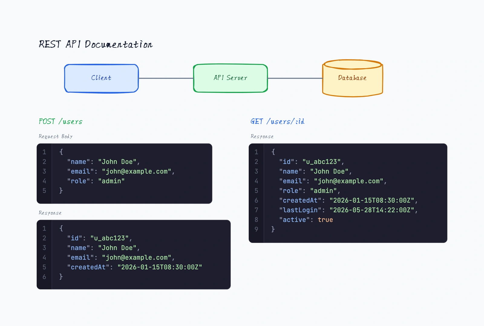
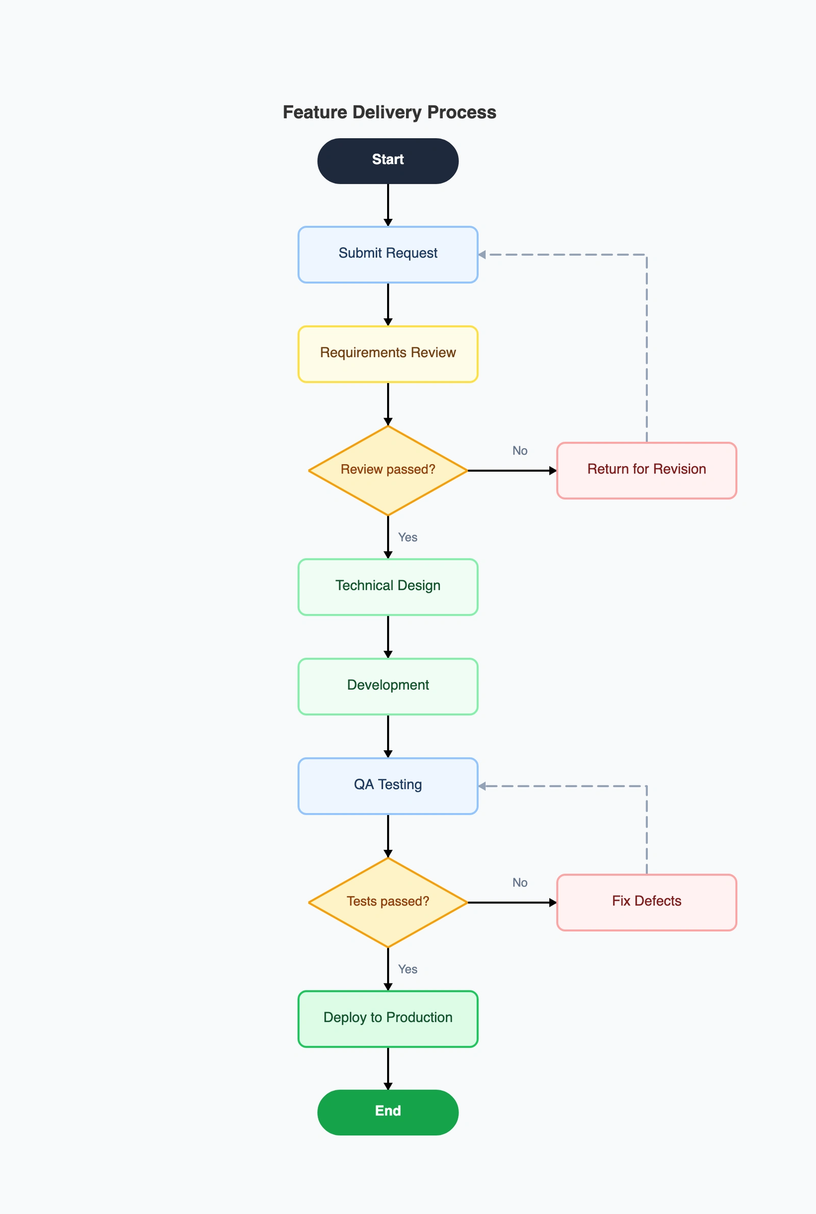
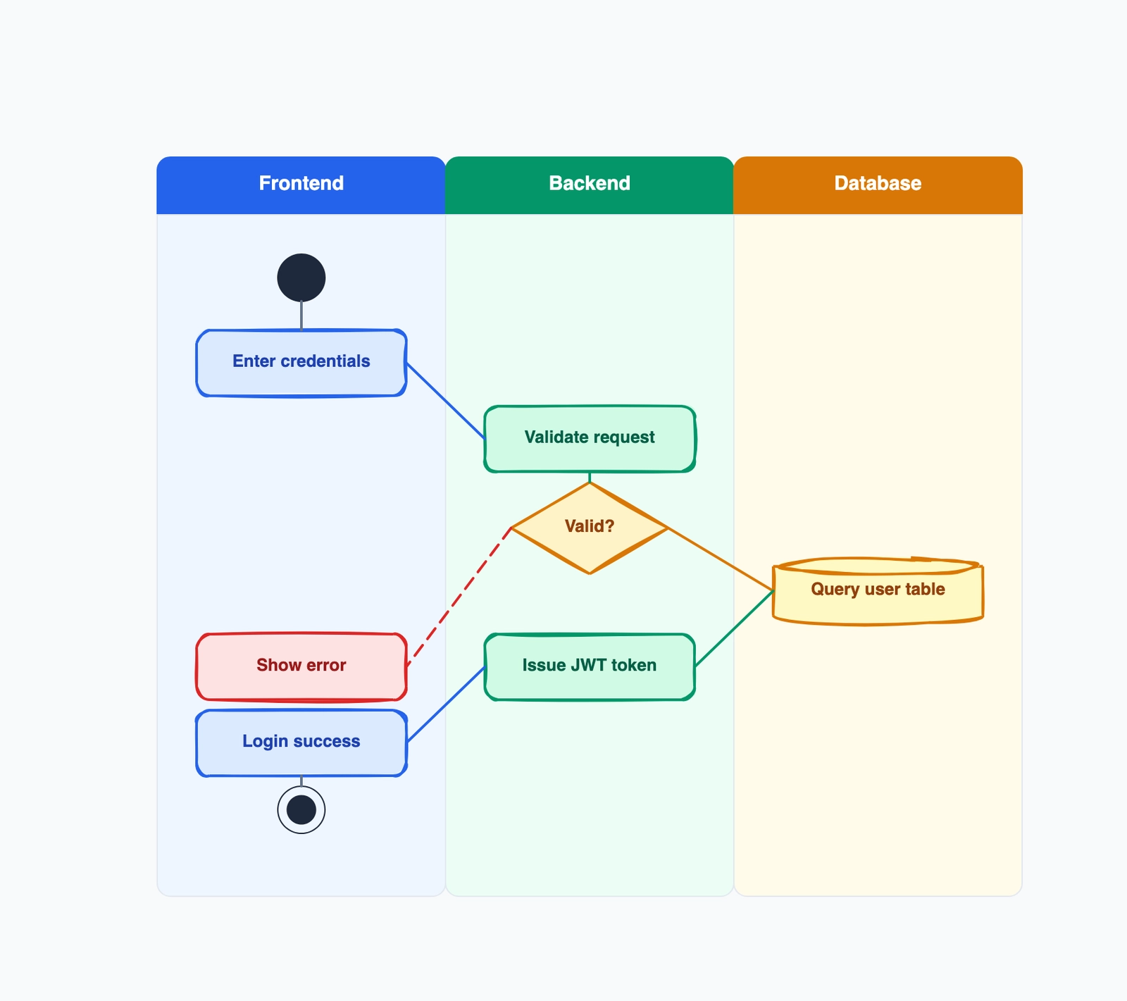
Quick example
Landing page wireframe
How it compares to similar tools
Wireframe vs. mockup
A wireframe is low-fidelity — gray boxes and placeholder text — focused on layout and structure. A mockup is high-fidelity — actual colors, typography, images — focused on visual design. Wireframe first to validate structure with the team; mockup second once structure is locked. Skipping wireframes and going straight to mockups locks you into structural decisions before they have been pressure-tested.
Wireframe vs. prototype
A wireframe is static. A prototype is clickable — you can navigate between screens to feel the flow. Wireframes answer 'what is on each screen'. Prototypes answer 'does the flow between screens make sense'. Use wireframes early for layout review; build a prototype before user testing.
Low-fidelity vs. high-fidelity wireframes
Low-fidelity wireframes use rough shapes and lorem ipsum — fast to make, fast to throw away, invite criticism on structure. High-fidelity wireframes use real content, accurate proportions, and proper UI components — slower to make but useful when you need stakeholder sign-off. Start low-fi for ideation, move to high-fi for handoff.
Common mistakes to avoid
Too much detail too early
Spending an hour picking the exact shade of gray for a wireframe is the wrong battle. Wireframes are about structure and hierarchy, not visual polish. Use gray boxes, basic typography, and placeholder content. If the wireframe is starting to look like a finished design, you have gone past wireframe stage.
Missing edge states
Only wireframing the happy path leaves the team unprepared for empty states, loading states, error states, and overflow content (long names, no results, network errors). For every screen, sketch the empty state, the loading state, and at least one error state. These three are where most UX bugs hide.
Wireframing pixels, not user goals
A wireframe should answer 'can the user accomplish their task'. If you cannot describe what the user is trying to do on each screen, the wireframe will produce a UI that is technically correct but useless. Annotate each screen with the user goal at the top.
Inconsistent components
Every button shape and size on every screen being different is a sign that the wireframe is being drawn screen-by-screen instead of as a system. Define a small kit (primary button, secondary button, card, list item) and reuse across screens. The discipline forces structural consistency.
Frequently asked questions
What is a wireframe?+
A wireframe is a low-fidelity sketch of a user interface that shows the layout of elements on each screen — buttons, inputs, text blocks, images — without color, typography, or final content. It is the structural skeleton of a design, used to validate layout and flow before investing in visual design.
What is the difference between a wireframe, mockup, and prototype?+
Wireframe is low-fidelity static layout. Mockup is high-fidelity static visual design. Prototype is interactive — you can click through screens. Most projects go through all three in sequence: wireframe to lock structure, mockup to lock visuals, prototype to validate flow.
What should I include in a wireframe?+
Layout of elements, hierarchy of content, navigation, key UI components (buttons, inputs, lists), and annotations explaining what each screen does. Skip colors, typography choices, and final copy — those distract from the structural review.
How many wireframes do I need for an app?+
One per distinct screen in the main user journey, plus one per important edge state (empty, error, loading) for the most critical screens. For a simple flow that is usually 5-15 wireframes; for a complex app, 30-50. If you find yourself at 100+, the design needs to be broken into modules with their own wireframe sets.
Can I create wireframes online for free?+
Yes. Open the CodePic wireframe template, drag shape primitives onto the canvas to lay out screens. The hand-drawn style is ideal for early wireframes because it signals 'this is a sketch' and invites structural feedback instead of nitpicks on visual style. Export to PNG, SVG, or share a live link.
Start editing online
Open the template in CodePic, replace the sample nodes, and turn it into your own study board in a few minutes.
See examples: /templates/wireframe/examples