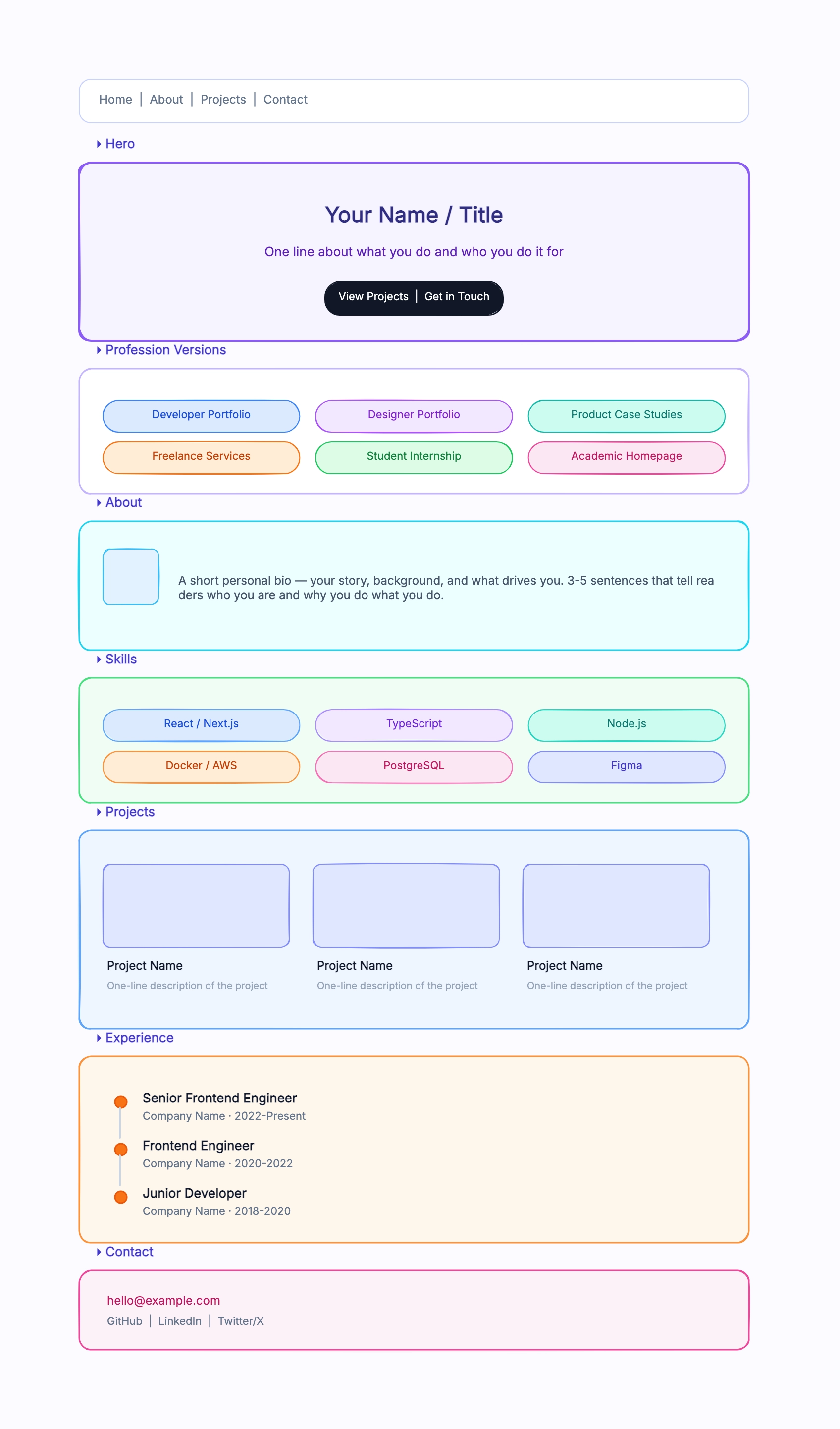
Developer portfolio
Who uses it: Software engineer or full-stack developer building a personal site to showcase work
Hero: Full name, title (e.g., Full-Stack Developer), tagline, two CTAs (View Projects / Download Resume)
About: Short paragraph + GitHub contribution graph or language stats widget
Skills: Icon grid — languages (TypeScript, Python, Go), frameworks (React, Next.js), tools (Docker, AWS)
Projects: 3-column card grid — each with thumbnail, title, one-line description, tech tags, GitHub + live demo links
Experience: Vertical timeline — role, company, dates, 2–3 bullet achievements per role
Contact: Simple form or row of social icons — GitHub, LinkedIn, Email, Twitter/X
Why this works: Developer portfolios need to answer two questions fast: what can you build, and have you built it before. Putting Projects and Skills above Experience means the visitor sees proof of ability before chronology.
Freelance landing page
Who uses it: Freelancer or independent consultant selling services rather than seeking employment
Hero: Name + service category (e.g., Brand Designer for SaaS Startups) + primary CTA (Book a Call)
Services: 3-column cards — Brand Identity, Web Design, Design Systems — with short descriptions
Selected Work: 4–6 project thumbnails in a grid, each linking to a case study or detail view
Testimonials: 3 client quotes with name, title, and company — social proof above the fold
Process: 4-step numbered section — Discovery → Strategy → Design → Delivery
Contact: Calendly embed or contact form + email + social links
Why this works: Freelance pages sell trust. The Service → Work → Testimonials flow answers: what do you do, can you show me, do other people vouch for you. The Process section demystifies what working together looks like.
Academic personal homepage
Who uses it: Researcher, professor, or PhD candidate presenting academic work online
Hero: Name, title (e.g., Assistant Professor of Computer Science), institution, headshot placeholder
About: Short bio paragraph focused on research interests, 2–3 sentence research statement
Publications: Reverse-chronological list — title, co-authors, journal/conference, year, PDF/DOI link
Teaching: Courses taught or TA'd with semester and brief syllabus note
News: Short dated list — accepted papers, talks, grants, awards
Contact: Office address, email, Google Scholar, ORCID, Twitter/X
Why this works: Academic homepages serve a different audience — peers, potential collaborators, and students. Publications and research interests go first. The design is deliberately minimal to keep the focus on content, not layout.
Student internship portfolio
Who uses it: Student or early-career professional applying for internships, scholarships, or junior roles
Hero: Name, target role, school or program, short tagline, CTA to Projects or Resume
About: 3–4 sentence learning story that explains current interests and direction
Coursework: Compact card grid — relevant classes, capstone projects, research labs, or certificates
Projects: 2–4 strongest projects with problem, role, tools used, and outcome
Experience: Internships, volunteer work, campus organizations, or part-time work with transferable skills
Contact: Email, LinkedIn, GitHub or portfolio profile, plus resume download
Why this works: Students often lack long work histories, so the layout should make learning signals visible. Coursework and projects sit above formal experience, and each project needs enough context to show how the student thinks, not just what technology was used.
Product manager portfolio
Who uses it: Product manager, product owner, or growth lead showing strategy and shipped outcomes
Hero: Name, product focus area, industries served, CTA to Case Studies
Case Studies: 3 large cards — problem, user insight, decision, shipped result, metric
Operating Style: Short section for discovery, prioritization, roadmap, and stakeholder habits
Artifacts: Screenshots or links to PRDs, launch plans, experiments, and roadmap samples
Experience: Timeline of roles with product scope, team size, and business impact
Contact: Hiring or advisory CTA, calendar link, email, LinkedIn
Why this works: Product portfolios should not look like generic resumes. Case studies go first because hiring managers want to see judgment: how you framed a problem, made tradeoffs, aligned people, and measured whether the work mattered.
Data analyst portfolio
Who uses it: Data analyst, BI analyst, or analytics engineer showing dashboards, methods, and business impact
Hero: Name, analytics focus area, industries or datasets, CTA to Dashboard Gallery
Featured Dashboards: 3 cards — business question, data source, metric, screenshot placeholder, result
Methods: Compact section for SQL, Python, BI tools, experimentation, and data storytelling
Case Studies: Narrative blocks — problem, cleaning approach, analysis, recommendation, outcome
Experience: Timeline with stakeholders served, reporting scope, and measurable process improvements
Contact: Email, LinkedIn, GitHub or portfolio repo, optional downloadable sample report
Why this works: Analytics portfolios work best when they connect technique to decisions. Dashboards alone can look decorative; framing each project around a business question and result shows that the analyst can turn data into action.
Content creator personal brand
Who uses it: Writer, educator, newsletter author, podcaster, or creator building a hub for their work
Hero: Name, topic niche, value promise, CTA to Subscribe or Start Here
Featured Work: 3–5 highlighted articles, videos, episodes, or guides with short context
Topics: Pill grid for recurring themes so visitors understand what the creator is known for
Proof: Subscriber count, featured publications, collaborations, testimonials, or speaking clips
About: Short story that explains the creator's point of view and credibility
Contact: Newsletter signup, media kit, collaboration email, and social links
Why this works: A creator site is less about employment history and more about trust, taste, and repeat visits. The layout should make the niche obvious, surface the best work quickly, and give people a low-friction way to follow or collaborate.
Creative portfolio
Who uses it: Designer, illustrator, or photographer presenting visual work
Hero: Full-width featured image or project with overlay title and subtitle
Work Grid: 3-column masonry-style layout with large project thumbnails, title, and category tag
About: Short personal statement + photo, emphasized with generous whitespace
Process: 3-step visual section — Research sketches → Design iterations → Final output
Clients: Logo grid of brands or organizations worked with
Contact: Minimal — email and Instagram/Dribbble links
Why this works: Creative portfolios let the work speak first. A full-width hero image sets the visual tone immediately. The work grid is the dominant section — visitors judge creative quality in seconds, so thumbnails need to be large and load fast.