A Venn diagram is a visual diagram that uses overlapping circles to show what different groups, categories, or sets have in common and where they differ. Each circle represents one set. The overlapping area shows shared attributes. The non-overlapping parts show what belongs only to one set.
That sounds simple, but it is exactly why Venn diagrams are useful. They take a comparison that might otherwise become a long list and turn it into something you can understand at a glance: this belongs here, this belongs there, and this belongs to both.
Why Venn Diagrams Work
Venn diagrams work because people compare things spatially even when the information starts as text. If two products share a feature, placing that feature in the overlap feels natural. If a customer segment appears in two markets, putting it in the shared area makes the relationship obvious.
The format is especially good for two jobs:
Comparing similarities and differences. A Venn diagram makes the "same vs. different" question visible. Instead of reading two separate lists and mentally matching them, the reader can see the shared area directly.
Sorting items into categories. If you are classifying ideas, users, features, topics, or requirements, a Venn diagram helps show whether an item belongs to one category, multiple categories, or none of the categories being discussed.
This is also the limit of the format. Venn diagrams are great for comparison and classification. They are not good for sequences, timelines, dependencies, or detailed numeric analysis.
Core Concepts
To read or create a Venn diagram, you only need a few concepts.
Set. A set is a group of things that share a category. In a product comparison, one set might be "features in Product A" and another might be "features in Product B." In a marketing example, a set might be "existing customers" or "newsletter subscribers."
Overlap or intersection. The intersection is the area where two or more circles overlap. Anything placed there belongs to all of those sets. If "real-time collaboration" appears in the overlap between two tools, both tools have that feature.
Union. The union is everything covered by the circles combined. If you are comparing two customer groups, the union includes everyone who belongs to either group or both groups.
Outside area. The area outside the circles represents items that do not belong to any of the sets shown. This is often left blank, but it can be useful when you want to show excluded options, non-users, out-of-scope requirements, or items that belong somewhere else entirely.
Types of Venn Diagrams
2-circle Venn diagram. This is the most common version. It compares two sets and has three meaningful areas: only A, both A and B, and only B. It is the best choice for most comparisons because it stays readable.
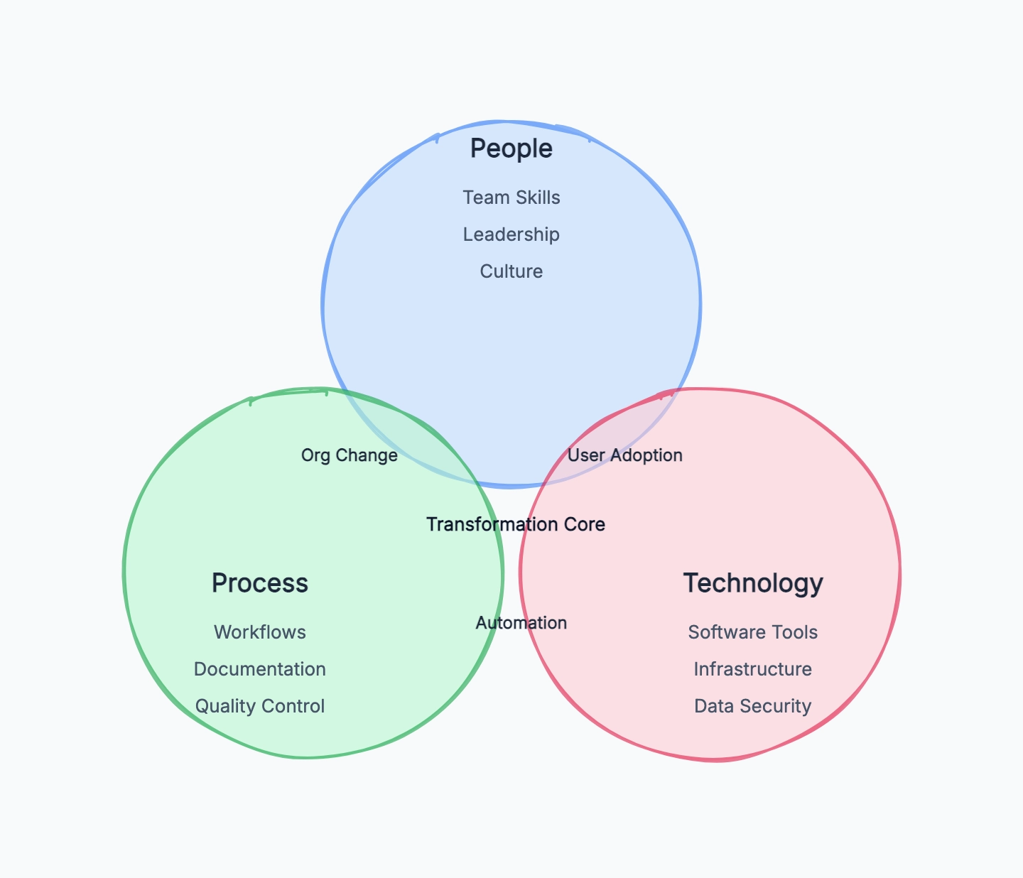
3-circle Venn diagram. This compares three sets and creates seven meaningful areas. It can be useful when the third category genuinely changes the analysis, but it becomes crowded quickly. If you cannot explain why the third circle is necessary, use two circles instead.
Euler diagram. An Euler diagram looks similar but is not required to show every possible overlap. It only shows relationships that actually exist. For example, if all "premium customers" are also "paying customers," one circle may sit entirely inside another. Venn diagrams show all possible intersections; Euler diagrams show the real relationships more directly.
In everyday use, people often call both formats "Venn diagrams." That is usually fine unless precision matters in a math or logic context.
Real-World Examples
Product Feature Comparison
A team comparing two diagramming tools might use one circle for Tool A and one circle for Tool B.
- Tool A only: offline mode, advanced export controls
- Shared overlap: flowcharts, real-time collaboration, comments
- Tool B only: AI diagram generation, unlimited free documents
This makes the tradeoff clearer than a paragraph of feature descriptions. The team can immediately see whether the shared basics are enough and which unique features actually matter.
User Segment Overlap
A marketing team might compare "people who signed up for a webinar" and "people who started a free trial." The overlap contains users who did both.
That overlap is valuable because it may represent a higher-intent audience. Instead of treating webinar attendance and product activation as separate metrics, the diagram highlights the users who connect both behaviors.
Course Topic Planning
A teacher planning a course might compare "topics students already know" with "topics required for the next module." The overlap is review material. The first circle's unique area may not need much class time. The second circle's unique area becomes the new material to teach.
The diagram helps avoid spending equal time on everything when some topics are already familiar.
Market Positioning
A startup could compare "features customers ask for" with "features competitors already offer." The overlap shows table-stakes expectations. The customer-only area shows potential differentiation. The competitor-only area may reveal features that look important in the market but are not actually demanded by your users.
That is a more useful conversation than simply asking, "Should we copy this competitor?"
How to Create a Venn Diagram
Step 1: Define what you are comparing. The objects need to be at the same level. Compare two products, two customer groups, two strategies, or two topics. Do not compare "marketing team" with "conversion rate" unless you are very clear about what each set represents.
Step 2: List unique attributes first. Write down what belongs only to each set. For a product comparison, these might be features. For a customer analysis, they might be behaviors or needs. Keep each item short enough to fit in the diagram.
Step 3: Identify the shared attributes. Move anything that belongs to both sets into the overlap. Be strict here. If something is only partly true for one side, add a note outside the diagram rather than forcing it into the shared area.
Step 4: Check the outside area. Ask what is intentionally excluded. Are there features neither product has? Are there users who fit neither segment? You may not need to draw these, but thinking about them prevents the diagram from implying that the circles cover everything.
Step 5: Avoid forcing three circles. A three-circle Venn diagram looks impressive, but it often makes the content harder to read. Add a third circle only when the relationships among all three sets are central to the question.
For a faster start, use the Venn diagram template. It gives you a clean three-circle structure with readable overlap areas, so you can replace the labels and move items into unique or shared zones immediately.
Common Mistakes
Comparing things that are not on the same level. A Venn diagram works best when each circle represents the same kind of object. "Enterprise customers" vs. "mobile app" mixes a user segment with a product surface. The overlap becomes vague because the sets are not comparable.
Putting too much text in the overlap. The overlap should carry the most important shared points, not every possible similarity. If the shared area has a paragraph inside it, the diagram is doing the job of a document poorly.
Using a Venn diagram for a process. If the question is "what happens first, then what happens next," use a flowchart. Venn diagrams do not show order, decisions, or movement over time.
Using more than three sets. Four-set Venn diagrams exist, but they are rarely readable in practical work. If you need to compare many categories, use a matrix or feature comparison table.
Treating overlap as importance. The shared area means "belongs to both," not "most important." A unique feature can be more strategically important than something in the overlap.
Venn Diagram vs. Other Tools
Venn diagram vs. matrix. Use a Venn diagram when the main question is "what overlaps?" Use a matrix when you need to compare many items across many criteria. A feature matrix is better for detailed product evaluation because it can show yes/no, partial support, pricing tiers, and notes.
Venn diagram vs. mind map. A mind map starts from one central idea and branches outward. It is better for brainstorming, topic exploration, and planning. A Venn diagram is better when you already have categories and want to compare how they relate.
Venn diagram vs. SWOT. SWOT organizes information into strengths, weaknesses, opportunities, and threats. It is a strategic analysis framework, not a set relationship diagram. Use SWOT to evaluate a business situation. Use a Venn diagram to compare groups or attributes.
Venn diagram vs. feature comparison. A feature comparison table is better when buyers need a detailed checklist. A Venn diagram is better earlier in the discussion, when you want to communicate the big picture quickly: what is unique, what is shared, and where the meaningful difference sits.
Frequently Asked Questions
What is a Venn diagram in simple words? A Venn diagram is a picture that shows how groups overlap. Each circle is a group, and the overlapping part shows what the groups have in common.
What is the main purpose of a Venn diagram? The main purpose is to compare sets by showing similarities and differences visually. It helps people understand shared and unique attributes faster than reading separate lists.
Can a Venn diagram have three circles? Yes. A three-circle Venn diagram compares three sets and includes areas for every possible overlap. Use it only when the third set adds real value, because three-circle diagrams can become crowded quickly.
What is the difference between a Venn diagram and an Euler diagram? A Venn diagram shows all possible overlaps between sets. An Euler diagram only shows the relationships that actually exist. In casual business and education use, people often use "Venn diagram" for both.
When should I not use a Venn diagram? Do not use a Venn diagram for workflows, timelines, project plans, or comparisons with many criteria. Use a flowchart for processes, a Gantt chart for schedules, and a matrix or table for detailed multi-criteria comparisons.
What tools can I use to create a Venn diagram? You can draw Venn diagrams on a whiteboard, in presentation software, or with diagramming tools. If you want a clean starting point, try CodePic's Venn diagram template — it includes pre-drawn circles you can fill in and rearrange.