Most "how to make a mind map" advice stops at the definition: put your topic in the middle, add branches, add sub-branches. That's technically correct and totally unhelpful when you're staring at a blank canvas.
This guide is the version I wish existed when I first tried to plan a project this way. It walks through building a real mind map — a product launch plan — in the browser, using a two-sided layout that stays readable as it grows. No signup, no installs — open a mind map starter in CodePic (or any similar online tool) and follow along step by step.
What a mind map actually gives you
Before the mechanics: a mind map is worth making when you're trying to answer "what does this whole thing consist of?" — a launch, a product area, an incident post-mortem, a book chapter. It's not a to-do list (a linear format is fine for that) and it's not a flowchart (which needs directional arrows). A mind map is a shape — you can see the balance, the gaps, and the branches that grew heavier than the rest.
The best mind maps use both sides of the center. One-sided layouts (everything spraying to the right) look tidy at first but get lopsided as branches grow. A two-sided (bidirectional) layout — some branches on the left, some on the right — keeps the whole map centered and easier to scan.
Step 1 — Pick the center
Open a blank canvas. Type your central topic and put it in the middle of the screen. Keep it short — three or four words. If you can't say what the map is about in that many words, the map won't help you clarify it either.
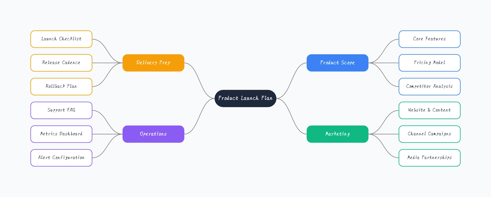
For this walkthrough the center is "Product Launch Plan". It's specific enough to have real branches, broad enough to hold a full team's work.
Step 2 — Split the map into left and right
Before you add any branches, decide the rough split. You don't need to know all the branches yet — just the two big buckets that will sit on each side.
For a launch plan, a natural split is "Everything we build" on one side and "Everything we do around the launch" on the other. In this map:
- Right side — Product Scope, Marketing (what we build and how we sell it)
- Left side — Delivery Prep, Operations (how we ship and support it)
The split doesn't have to be perfectly clean. What matters is that each side has roughly equal weight, so the map doesn't lean.
Step 3 — Add first-level branches
Drop the four branch names near the center — two on the left, two on the right. Don't worry about spacing; a good editor will lay them out for you. In CodePic, you select the root, click the small "+" icon that appears on either side, and a new child node opens ready for typing. Add one, hit Tab or the "+" again for the next.
The rule of thumb for first-level branches: three to six per side. Fewer and you might as well use a list; more and the map turns into a starburst that's hard to read.
Step 4 — Fill in sub-branches, one branch at a time
Now go through each first-level branch and add its children. Do this one branch at a time — don't jump around. This helps you notice when a branch is thinner than you expected (a sign you haven't thought about it enough) or fatter than the others (a sign it might deserve its own map).
For the launch plan:
- Product Scope → Core Features, Pricing Model, Competitor Analysis
- Marketing → Website & Content, Channel Campaigns, Media Partnerships
- Delivery Prep → Launch Checklist, Release Cadence, Rollback Plan
- Operations → Support FAQ, Metrics Dashboard, Alert Configuration
Notice that each first-level branch has three children. That's not a rule — it's just what "feels balanced" here. Some of your branches will have two, some will have five. If one has fifteen, split it into two branches.
Step 5 — Prune, don't polish
The most common mind mapping mistake is treating the first draft as final and spending time on colors and fonts. Don't. Instead, look at the map and ask:
- Is every branch pulling its weight? Any branch with only one child is either not really a branch (fold it into a sibling) or is under-explored (add more children).
- Are the two sides balanced? If the left side has 12 nodes and the right has 4, the split is wrong — rethink Step 2.
- Is there a branch that repeats another? Merge them. Duplication is the enemy of clarity.
Only after the structure is solid should you touch styling — and even then, less is more. Bold for first-level branches, plain for the rest. That's usually enough.
Step 6 — Rearrange by dragging
Structure changes as you think. Good editors let you drag a node onto another node to reparent it, or between two siblings to reorder. In CodePic, dragging a node across the root's centerline switches it to the other side automatically — so if you realize "Rollback Plan" fits better under Operations than under Delivery Prep, you just drag it over.
If the two sides get unbalanced later, drag whole branches between sides too. The layout re-flows so both sides stay centered.
Step 7 — Export or share
Once the map holds together, you have three usual moves:
- Screenshot / PNG export — for slide decks or Notion pages
- Public share link — for read-only review by teammates
- Keep it live — if the map is a working document you'll update weekly (a team's OKR map, a book outline)
For the launch plan example, the "keep it live" option is the right one. Launch plans change every week; a mind map that's re-opened and edited is far more useful than a screenshot from three weeks ago.
Common mistakes to skip
A few patterns that show up in almost every first mind map:
- Writing sentences in nodes. Nodes hold labels, not descriptions. If a node needs an explanation, that's a sub-branch, not longer text.
- Making the root a full sentence. "Everything we need to do for the Q3 launch of feature X" is not a topic — "Q3 Feature X Launch" is.
- One-sided layout for maps with more than eight branches. They stop fitting on screen and get tiring to scan.
- Adding decorative icons before the structure is stable. Icons feel like progress but don't help thinking.
Why online (versus a desktop app)
The main reason to make a mind map online is the same reason people moved away from desktop diagramming tools: friction. Opening a new browser tab is faster than launching an app, sharing a link is faster than exporting a file, and if a teammate needs to look at the map, "click here" beats "install this and open the .xmind file."
The trade-off used to be that browser mind mappers felt cramped or slow. That's mostly gone now — modern web canvas apps are as responsive as anything native, and they don't lock your maps inside a proprietary file format.
For the specific case in this guide, open the pre-laid mind map template and start editing — the two-sided layout with drag-to-reparent is exactly the workflow described here.
Bottom line
Making a mind map isn't complicated, but it's easy to make a bad one — usually by starting with a topic that's too vague, going one-sided when the content is two-sided, or polishing before the structure is right. Follow the seven steps above and you'll skip the usual traps. The maps you'll produce won't be prettier than average, but they'll be more useful — which is the only measure that matters.