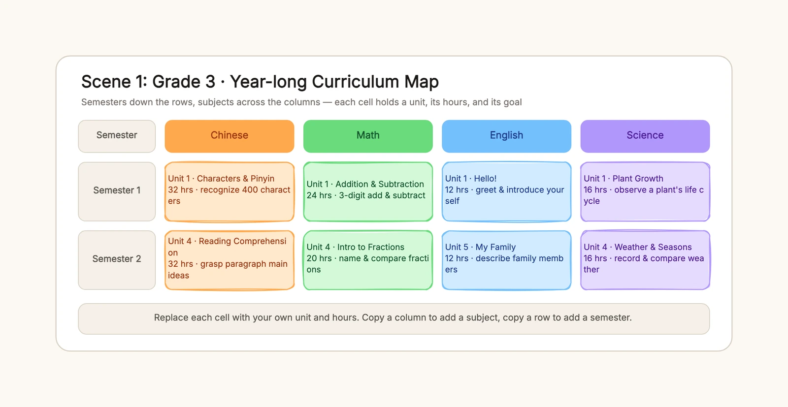
A curriculum map is the one-page answer to a question every teacher and program lead faces at the start of a term: what do we actually teach, and in what order? It puts the whole year or the whole program on a grid — semesters or grades down the rows, subjects or units across the columns — so each cell is a unit with its hours and its goal. You can start from the curriculum map template and replace the units, hours, and goals directly in the browser.
This guide explains what a curriculum map is, how it differs from a lesson plan, and how to build one that a department can actually read and revise.
What a curriculum map is for
A curriculum map is not a list of topics and it is not a syllabus. A syllabus is a document students read — policies, deadlines, expectations. A curriculum map is a working grid that shows coverage and sequence, the two things that decide whether a year hangs together or drifts into gaps and overlaps.
A useful map should answer four questions at a glance: which units are taught, in which term or grade, for how many hours or credits, and toward what goal. When those four things sit in a grid, three problems solve themselves. A new teacher can see where each unit sits without reading a year of lesson plans first. A department can spot the gap where one concept is never taught and the overlap where two grades teach the same thing. And a revision — a new textbook, a new standard — becomes a set of cells to move rather than an argument about what used to be where.
The distinction that matters most is scope versus depth. A lesson plan zooms into one class period: objectives, materials, a sequence of activities. A curriculum map zooms out to the whole program. You do not write lesson-level detail into every cell of a map, and you do not try to see the whole year inside a single lesson plan. Each has its own job.
How to build a curriculum map
The map only works if the axes are right before you fill a single cell. Most maps come down to three layouts, and the one you pick depends on what you are mapping.
1. Fix the axes
Decide what goes down the rows and what goes across the columns. For one grade, semesters go down and subjects go across. For one subject, semesters go down and strands or units go across. For a major, years go down and course modules go across. The axes are the whole point: they are what make the sequence visible instead of buried in a list.
2. List the subjects or strands and give each a color
Before filling cells, name the columns and give each one its own color. Color is not decoration here — it is how a reader tells one subject from another at arm's length. Four subjects in four shades of gray read as a wall of boxes; four subjects in four colors read as a map.
3. Fill each cell with a unit, hours, and a goal
Resist the urge to write a description. Each cell needs exactly three things: the unit name, its hours or credits, and one clear goal. "Unit 1 · Addition & Subtraction — 24 hrs — 3-digit add & subtract" is complete. Anything more belongs in the lesson plan, not the map.
4. Order the cells so concepts build
Read each row left to right and each column top to bottom. If a concept in a later cell assumes an earlier one, the earlier one must sit earlier in the reading order. This is the step that turns a grid into a curriculum map: the sequence, not just the coverage, becomes visible.
5. Mark what is changing
If a unit is new, moved, or dropped, mark it in a different color or note it. The map is a living document; the marks are how the team sees the delta at a glance instead of rediscovering it in a meeting.
6. Share it and update it together
A map only aligns a team if the team sees it. Put the board where the department can read it, and update it together when a unit moves between terms. A map that lives on one person's laptop is a list again.
Grade, subject, and program: three maps in one template
The three scenes in the template cover the shapes a curriculum map actually takes.
One grade across a year
The elementary scene maps Grade 3 across a full year: semesters down, four subjects — Chinese, math, English, and science — across. Each cell carries a unit, its hours, and its goal, from "Characters & Pinyin" in Chinese to "Plant Growth" in science. This is the map a homeroom teacher shares with parents and colleagues to show what the year actually covers.
One subject across semesters
The middle-school scene flips the axis to a single subject, junior math, laid out by strand — number and algebra, geometry, statistics and probability — across three semesters. Here the value is the progression: you can watch rational numbers build toward real numbers and toward polynomials, and basic geometry build toward congruence. This is the map a department head uses to check that nothing is skipped and nothing is taught twice.
A four-year major
The university scene maps a computer science program: years down, three course modules across — foundation, core, and practice and elective — with each cell holding a course, its credits, and its goal, from calculus in year one to a capstone in year four. This is the map for program brochures, advising, and checking that prerequisites and practice line up across years.
Common curriculum map mistakes
Mapping only the topics, not the sequence
A list of units is not a map. The sequence — what builds on what, and in what order — is the part that makes the grid useful. Order the cells before you call it done.
Leaving cells empty or as labels
A grid of subject names with blank boxes tells you nothing. Fill every cell with a unit, its hours, and a goal, even if the goal is a placeholder you will revise later.
Writing lesson-level detail in every cell
A map is scope, not daily planning. When a cell starts to list activities and materials, you have crossed into lesson-plan territory. Keep the map at unit, hours, and goal.
One color for everything
If every subject is the same color, the map becomes a wall of boxes. Color-code subjects or strands so the grid reads at a glance.
Building it alone and never sharing it
A map only aligns a team if the team sees it. Share the board with the department and update it together, or the map quietly becomes one person's private notes again.
Audit the map before weekly planning
Run four passes while the whole year is still visible. First, trace every priority standard to at least one unit and one piece of evidence; a standard that appears only in a label is not yet taught or assessed. Second, mark prerequisite relationships. If students must interpret ratios before a later science investigation, the supporting mathematics must occur early enough to be useful.
Third, total instructional hours by month rather than assuming every calendar box has equal capacity. Holidays, testing windows, trips, and reporting periods create short months. When planned hours exceed available hours, cut or combine work now instead of silently compressing it later. Finally, read across subjects or strands to find clusters: several major projects due in the same week may be individually reasonable and collectively impossible.
Record each audit finding as a map change with an owner. “Move Unit 4 earlier” is incomplete; “science lead moves the data unit before the April field study and confirms the assessment by Friday” can be closed. That decision log also explains why next year's map differs from this year's.
Finish with a coverage key: introduced, practiced, assessed, or revisited. Those labels prevent a colored cell from falsely implying mastery and make it easier for the next teacher to see what students have actually encountered.
Note where evidence is still missing so the map does not hide an assumption.
Keep the map alive
A curriculum map is at its best when it is revised as often as the program changes. After a term, note which units ran long, which ran short, and which moved, then update the map so next year starts from reality rather than from a plan that no longer matches. A short version — the axes and the column colors — is often all a colleague needs to add their own units on top.
Start with the curriculum map template, fix the axes, and fill the cells with your own units and hours. When you need to zoom into a single class period, the lesson plan template picks up where the map leaves off; for the week-by-week rhythm at home, see the homeschool schedule template.