Back to template

Microservices Architecture Examples

These microservices examples show how teams split responsibilities across services, databases, gateways, and event buses. Use them to reason about service boundaries before changing production architecture.

Microservices Architecture Examples

Real examples

E-commerce platform

Who uses it: Backend engineer designing service boundaries for an online store

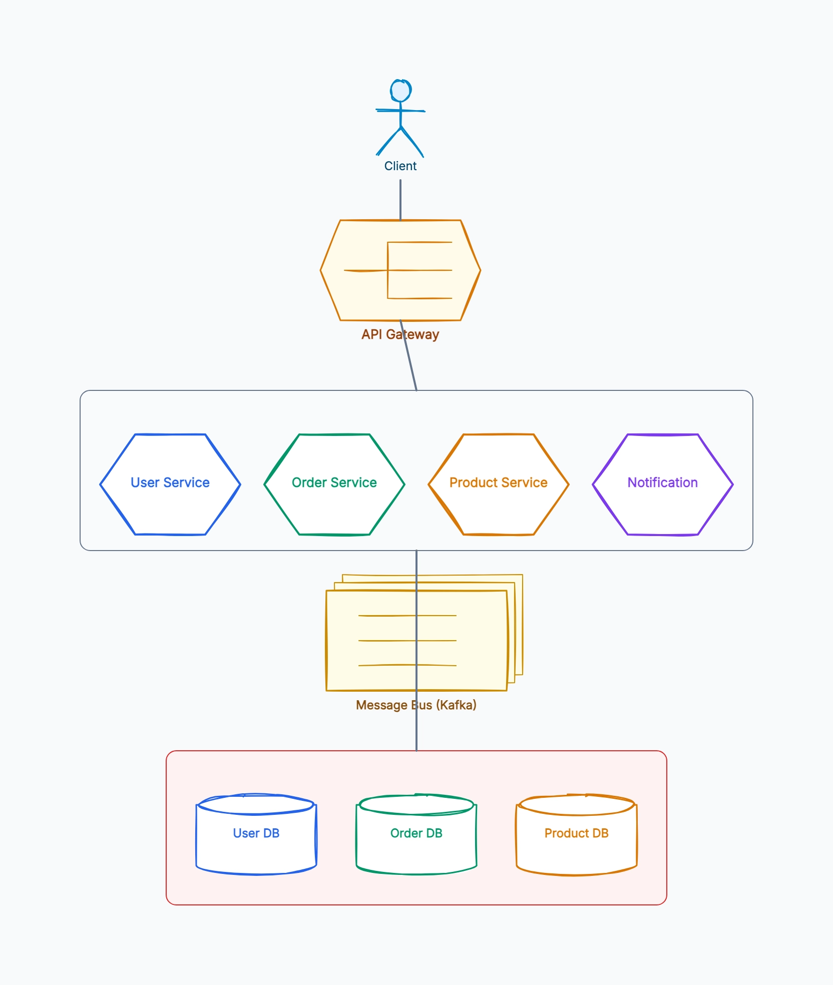
Client → API Gateway
Gateway routes to User, Catalog, Cart, Order, Payment services
Order Service emits OrderCreated event to Kafka
Inventory Service reserves stock asynchronously
Notification Service sends email/SMS after order confirmation
Each core service owns its own database

Why this works: The diagram makes the most important boundary visible: orders, payments, and inventory should not share one database. Service autonomy depends on data ownership, not just separate code repositories.

SaaS collaboration product

Who uses it: Engineering team splitting a monolith into domain services

Workspace Service owns teams, members, and permissions
Document Service owns documents and version history
Comment Service handles threaded discussions
Realtime Gateway manages WebSocket connections
Event bus distributes document updates and notifications

Why this works: Collaboration products often mix synchronous requests with realtime events. Showing both paths helps reviewers decide which updates require immediate consistency and which can be eventually consistent.

Notification platform

Who uses it: Platform team building reusable notification infrastructure

Producer services → Notification API
Notification API validates templates and preferences
Kafka topic fans out to Email, SMS, Push workers
Delivery receipts return to Delivery Store
Admin UI reads delivery status and failure reasons

Why this works: A notification platform is a good microservices example because the producer services should not know how each delivery channel works. The diagram exposes that decoupling clearly.

Monolith to microservices migration

Who uses it: Tech lead planning a gradual architecture migration

Monolith remains behind API Gateway
Extract Auth Service first with clear token boundary
Extract Catalog Service with read-heavy database
Use events to sync data during transition
Retire monolith modules only after traffic is moved

Why this works: A migration diagram should show the temporary hybrid state. Teams get into trouble when they draw only the final architecture and ignore the transition path.

Tips for better microservices architecture diagrams

  • Draw data ownership explicitly; a shared database often means the services are not truly independent.
  • Use dashed or differently colored edges for asynchronous events so they are not confused with request/response calls.
  • Group infrastructure components such as gateways, queues, caches, and databases separately from business services.
  • Keep the first diagram high-level; add sequence diagrams later for specific workflows.

Related resources

How it compares to similar tools

Microservices diagram vs monolith diagram

A monolith diagram shows layers stacked inside one deployable — controller, service, repository. A microservices diagram shows independently deployable units and the network between them. The critical difference is that every line in a microservices diagram is a potential failure point, which is why latency and retry behavior belong on the diagram.

Service diagram vs deployment diagram

A service diagram answers "what are the logical boundaries and who owns what." A deployment diagram answers "where does this actually run — which cluster, region, instance count." Teams often try to merge them and get a diagram that's too crowded to serve either purpose. Draw them separately.

Synchronous call graph vs event flow

Mixing REST calls and async events on the same lines is the most common source of confusion in microservices diagrams. A synchronous call means the caller blocks and shares the callee's failure; an event means fire-and-forget with eventual consistency. Use visually distinct line styles, or the diagram actively misinforms readers about coupling.

Microservices diagram vs C4 model

C4 prescribes four fixed zoom levels (context, container, component, code) and works well for organizational consistency across many teams. An ad-hoc microservices diagram is faster and better for one specific discussion. If you only need to settle one question this week, don't adopt a whole framework to do it.

Common mistakes to avoid

  • Drawing a shared database across services

    If two services read and write the same tables, they are not independently deployable — you have a distributed monolith. Drawing this honestly is valuable: it makes the coupling visible so the team can decide whether to accept or fix it. Hiding it behind two database icons that happen to be the same instance is how the problem persists.

  • Omitting the failure and retry story

    A diagram showing only happy-path arrows implies the system works whenever all services are up — which is never the interesting case. Annotate timeouts, retries, circuit breakers, and fallbacks on the calls where they exist, and note the ones where they're missing.

  • Making services too granular on the diagram

    Thirty boxes with one arrow each looks impressively decomposed but tells the reader nothing about boundaries. Group by business capability first; if a set of services always deploys and fails together, draw them as one box with a note, because operationally that's what they are.

  • Leaving out the API gateway and auth boundary

    Where authentication happens determines the entire security model. If the diagram doesn't show whether a service is publicly reachable or only reachable through the gateway, security reviewers cannot use it — and that's one of the main audiences for this kind of diagram.

Frequently asked questions

How do I decide service boundaries before drawing?+

Draw boundaries around data ownership, not around code convenience. Each service should own its data and expose it only through its API. A practical test while diagramming: if a proposed service can't be deployed without simultaneously deploying another, the boundary is in the wrong place and the diagram should show them merged.

Should the diagram include databases per service?+

Yes — data ownership is the defining characteristic of microservices, so hiding it removes the most important information. Give each service its own datastore symbol, and if several genuinely share one, draw that shared dependency explicitly rather than quietly duplicating the icon.

How do I show async messaging and event buses?+

Draw the broker (Kafka, RabbitMQ, SQS) as a distinct element rather than as a line, then connect producers into it and consumers out of it. This matters because the broker decouples the two sides: producers don't know their consumers. A direct producer-to-consumer arrow would imply coupling that doesn't exist.

How detailed should a microservices diagram be for onboarding?+

For a new engineer, keep it to services, their datastores, the gateway, and the two or three most important call paths — ideally annotated with a real user request tracing through the system. Full inventory diagrams overwhelm newcomers; a single traced request teaches the architecture much faster.

How often should this diagram be updated?+

Tie updates to service-boundary changes, not to code changes. Adding an endpoint doesn't affect the diagram; splitting a service, introducing a broker, or changing who owns a datastore does. Put a last-reviewed date on it so readers know how much to trust it.
Start editing online

Go back to the template, swap in your own content, and keep the same structure if it fits your project.

Use this template: /editor/new?template=microservices

Use this microservices template