A store layout is the difference between a shop people walk through and a shop people get lost in. It decides whether shoppers drift past the things they came for, whether the checkout line backs into the door, and whether a restock cart blocks the one aisle everyone wants. Get it right and the space quietly sells more; get it wrong and you spend the day untangling foot traffic instead of serving customers.
This guide walks through how to plan a store layout from a blank floor, then shows the three shapes it takes for a grocery store, a retail store, and a convenience store. You can open the store layout template and drag the zones, shelves, and flow to match your own unit.
What a store layout actually is
A store layout is not furniture placement. It is a plan of movement — where shoppers enter, how they pass the shelves, where they pay, and how the stock gets onto those shelves without crossing the customer's path. A workable layout answers four questions at once: where the entrance and exit sit, how the aisles guide people through the departments, where the checkout catches them, and how the stockroom feeds the shelves.
The thing most first-time planners miss is that a store has two flows, not one. The customer flow runs from the door, through the aisles, to the register. The restock flow runs from the stockroom, to the shelves and cold storage, and back. When the two share the same lane, a delivery at 2 p.m. shuts down the aisle everyone wants at 2:15. A good store layout keeps them apart — and on the plan, that means the two arrows should never cross.
The four zones every store layout needs
Almost every shop, however different, reduces to the same four zones.
The entrance and exit. This is where the store layout earns or loses its first impression. The entrance needs a clear sight line to the checkout, so a first-time shopper immediately sees where to pay and relaxes into browsing. The exit is where impulse buying happens, so keep a small rack of high-margin items within reach of the queue.
The shelf aisles. This is the main body of the plan. Aisles should read as a path, not a maze — either a straight grid or a loose loop, never a dead end that makes shoppers double back into a crowd.
The checkout. Position it between the entrance and the exit so the queue runs sideways rather than back through the door. The single most common store layout failure is a register whose line backs up into the entrance.
The stockroom. Tucked at the back with a restock route that reaches the shelves and cold storage without crossing the sales floor. Small shops can compress this to a cupboard behind the counter, but the route still has to exist on paper.
How to plan a store layout, step by step
1. Mark the fixed points first
Before you place a single shelf, mark the things that can't move cheaply: the entrance, the delivery door, any load-bearing walls, and the plumbing for produce misters or cold storage. Fridges and wet fixtures are anchored to water and drains; design the movable shelves and counters around them, never the other way.
2. Route the customer path
Draw the path a shopper should take from door to register. For a grocery store that is a grid; for a boutique it is a loose free-flow loop; for a convenience store it is one short arc. The path should pass the departments in an order that makes sense — fresh and high-margin items early, staples and heavy items near the end, impulse items right before the register.
3. Lay out the aisles and departments
Assign each department its zone and give it a shelf run. Keep the main aisle wide enough for two carts to pass and the secondary aisles wide enough to turn. If a plan looks crowded on paper, it will feel crowded in person — add space now rather than after the shelves are bolted down.
4. Place the checkout
Put the register between the entrance and exit, with the queue running sideways. Leave a clear sight line from the door to the register and keep a buffer between the end of the queue and the entrance so a rush never blocks the way in.
5. Draw the restock path
Route stock from the stockroom to the shelves and cold storage along the back and side walls, off the customer path. Mark it with a dashed line so it reads as a separate flow.
6. Test the two flows against each other
Walk the customer path and the restock path on the plan and check they do not cross. If a delivery at the back door would cut through the produce aisle, move the stockroom door or reroute the aisle. This single check catches most of the mistakes that show up only after opening day.
Grocery store layout example
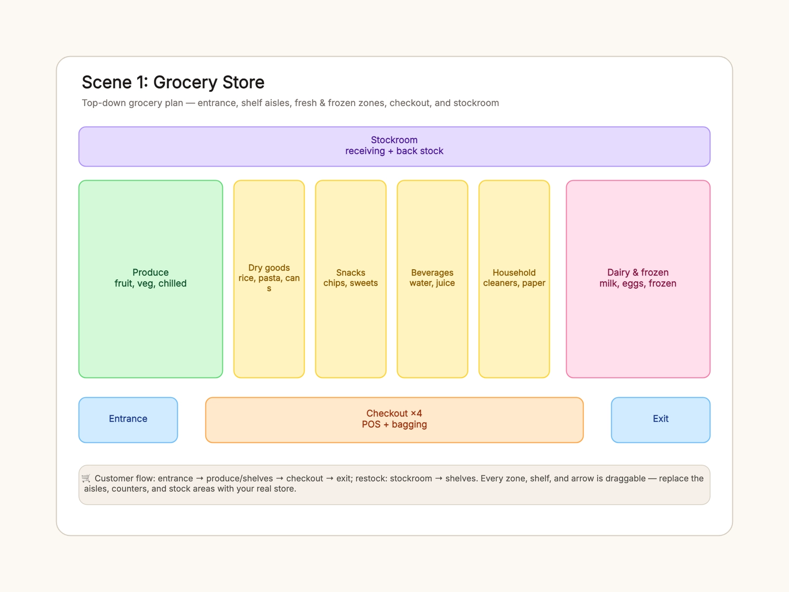
A grocery store layout is a grid with the fresh zones on the perimeter and the dry goods in the middle. The perimeter is where the plumbing lives, so produce, dairy, and frozen hug the outer walls; the center aisles hold dry goods, snacks, beverages, and household items. The checkout sits between the entrance and the exit, with enough lanes that the queue runs sideways instead of into the door.
The customer path leads through produce first — fresh and higher-margin — then into the dry goods, then back out through the checkout. The restock path runs along the back wall from the stockroom to the cold storage and the shelves, so a morning delivery never blocks the produce aisle a shopper wants at 9 a.m. This is the default scene in the store layout template: four dry-goods aisles, produce on the left, dairy and frozen on the right, and four checkout lanes between the doors.
The mistake that costs a grocery store the most is dead-end aisles. When a shopper reaches the end of a shelf run and hits a wall, they double back into oncoming traffic. A grid only works when the aisles open onto a cross aisle at both ends.
Retail store layout example (clothing)
A retail store layout for a clothing shop trades shelf density for dwell time. The window display sits at the front to pull people in, the clothing racks fill the middle, fitting rooms sit near the back, and the checkout stands front and center. The path is a loose loop: entrance, past the window and the new arrivals, through the racks, into a fitting room, and back to the register.
Spacing matters more than rack count here. Two shoppers carrying armfuls of clothes need room to pass, and a fitting-room queue should never block a rack. A thrift store layout follows the same free-flow shape but leans the other way — denser racks, a communal mirror instead of private rooms, and a fast single checkout near the exit, because the business runs on volume and quick turnover rather than a slow browse.
Where the grocery store optimizes throughput, the clothing store optimizes dwell. The layout should make a shopper comfortable taking their time, which is why the fitting rooms are the real destination and the racks are just the route to them.
Convenience store layout example
A convenience store layout is a short, counter-forward loop. The register anchors the front with the oden pot and coffee beside it, fridges and freezers line the back wall, and a hot-food corner sits next to the register for impulse buys. The customer path is one arc: in, grab, pay, out.
The logic is entirely different from a grocery store. Here the goal is not to lead shoppers past as much as possible, but to make a short trip effortless — high-margin items like drinks, snacks, and hot food sit directly on the path to the counter, and the stockroom shrinks to a cupboard behind the register so restocking never crosses the floor. The whole plan fits in a unit a tenth the size of the grocery scene, which is exactly the point.
Store layout vs. a floor plan vs. CAD
These three get confused, so it is worth drawing the line. A store layout is a fast, editable concept of zones, aisles, and flow — the thinking tool you use before anyone opens CAD. A floor plan is the same top-down view but usually drawn to a specific space, and it may or may not carry the movement thinking. A CAD drawing is dimensionally exact and is what you hand to a contractor, a landlord, or the permit office.
You do not make this template to-scale. You use it to settle where the shelves, checkout, and stockroom go and how people move, then hand the agreed concept to a designer for the dimensioned drawing. The restaurant floor plan template does the same job for dining rooms and kitchens, and the warehouse layout template does it for storage — the movement thinking is shared even when the contents differ.
Common store layout mistakes
Customer and restock paths that cross
When the delivery door is behind the register and stock runs through the sales floor, shoppers and staff collide. Keep the restock route on the back and side walls, off the customer path.
Aisles too narrow to pass
Two shoppers who cannot pass each other in the main aisle is a layout problem, not a customer problem. Keep the primary aisle at least 6–8 feet wide and the secondary aisles wide enough to turn a cart.
A checkout that blocks the entrance
A queue that backs into the door stops new customers from coming in. Place the register between the entrance and exit with the queue running sideways.
Dead-end aisles
A shelf run that ends in a wall makes shoppers double back. Every aisle should open onto a cross aisle at both ends, or loop back to the main path.
Ignoring the fixed plumbing and delivery door
The perfect plan falls apart when the fridges and produce misters can't move without major plumbing work. Mark the fixed points first, then design around them.
Keep the layout useful after opening day
A store layout is never finished — it changes as departments grow, as a category gets hot, and as the delivery schedule shifts. Review the plan a few months in and note where shoppers actually cluster and where they hesitate; those are the shelves that should move. Keep a copy of the board handy so a seasonal reset or a new fixture order starts from the real layout rather than a memory of it.
Start with the store layout template, replace the departments and counters with your own, and check the two flows before you commit to a lease or a fixture order. For a cafe or restaurant, the restaurant floor plan template applies the same movement thinking to tables and kitchens; for an event or market, the event floor plan template arranges stalls and queues the same way.