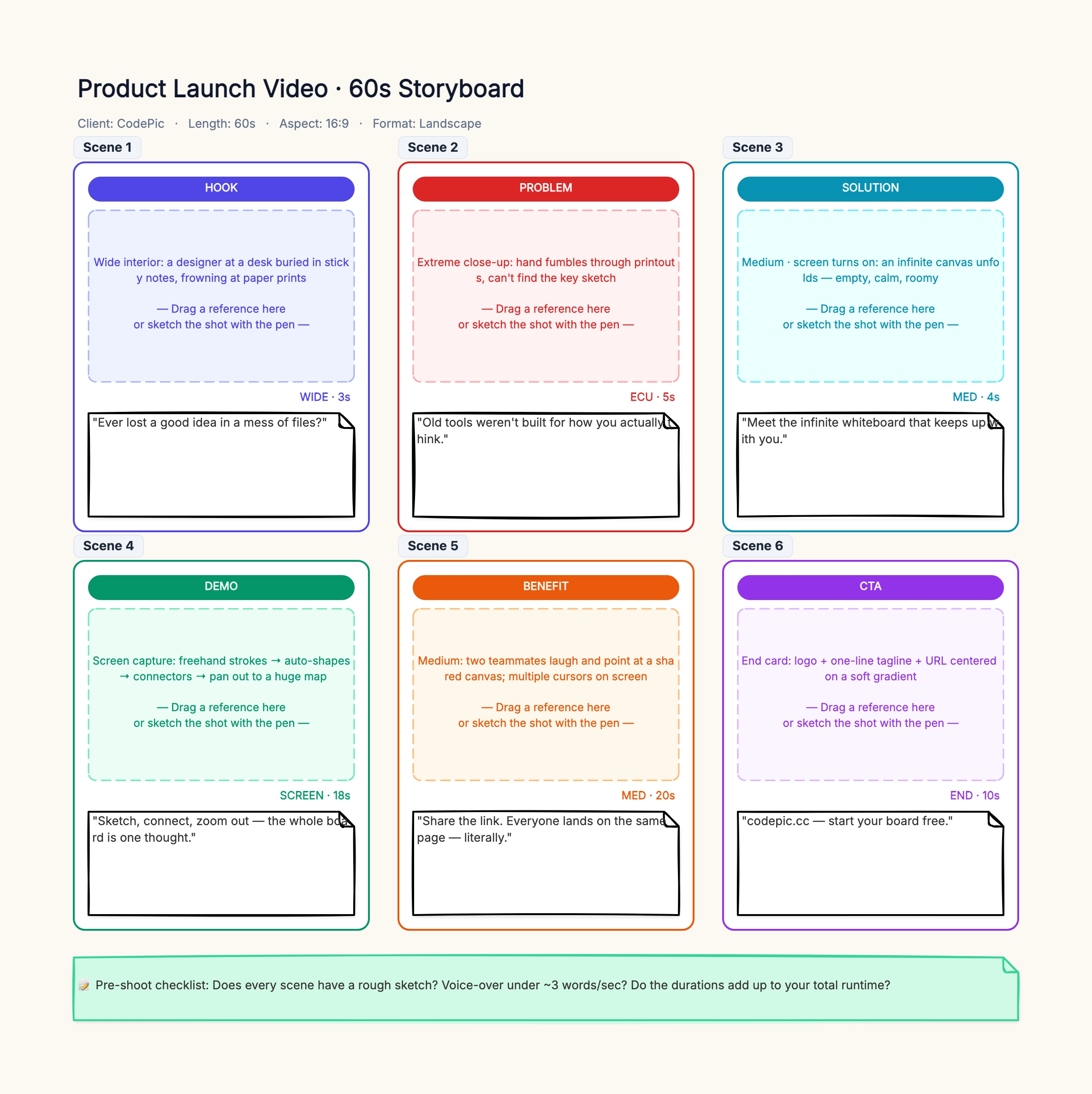
60-second product launch video
Who uses it: Product marketer or founder introducing a SaaS product on the homepage
Scene 1 · HOOK (WIDE · 3s): frustrated user surrounded by tangled tools
Scene 2 · PROBLEM (ECU · 5s): close-up on the specific pain moment
Scene 3 · SOLUTION (MED · 4s): product reveal, clean UI shot
Scene 4 · DEMO (SCREEN · 18s): key feature walkthrough with cursor movements
Scene 5 · BENEFIT (MED · 20s): happy users, testimonial soundbites
Scene 6 · CTA (END · 10s): logo, tagline, URL, promo code
Why this works: This is the direct-response commercial structure Hollywood, YouTube ads, and DTC brands use because it works. The 60-second budget is tight enough to force cutting, long enough to include a real feature demo. Notice how the shot type alternates (WIDE / ECU / MED / SCREEN / MED / END) — that visual rhythm is what keeps the viewer awake.
15-second TikTok / Instagram Reels short
Who uses it: Creator or social media manager producing a vertical short
Scene 1 · HOOK (CU · 2s): face-to-camera, one bold question
Scene 2 · CONTEXT (WIDE · 2s): the setting or problem visually
Scene 3 · SETUP (MED · 3s): the twist starts to unfold
Scene 4 · PAYOFF (MCU · 3s): the reveal or resolution
Scene 5 · PROOF (SCREEN · 3s): screenshot, stat, or evidence
Scene 6 · CTA (CU · 2s): 'follow for more' or 'link in bio'
Why this works: TikTok/Reels punishes anything longer than 3 seconds without a visual change. This layout enforces a cut every 2–3 seconds. Rename badges to HOOK / CONTEXT / SETUP / PAYOFF / PROOF / CTA — the platform's algorithm rewards this exact rhythm. The runtime subtitle should say 'Length: 15s · Aspect: 9:16 · Format: Vertical.'
2-minute animated explainer
Who uses it: Startup or B2B marketer commissioning a whiteboard-animation explainer
Scene 1 · HOOK (0:00–0:15): character encounters the problem
Scene 2 · PROBLEM (0:15–0:35): pain scaled — 'this happens to every X team'
Scene 3 · SOLUTION (0:35–1:00): product enters, one clean visual reveal
Scene 4 · HOW IT WORKS (1:00–1:30): 3 numbered steps, each 10 seconds
Scene 5 · PROOF (1:30–1:50): logos, numbers, testimonial soundbite
Scene 6 · CTA (1:50–2:00): URL, book-a-demo button, one final line
Why this works: For animation, the image placeholder holds a rough keyframe (stick figures are fine) and the voice-over sticky includes frame-accurate timing marks like '0:38 — cursor clicks the button.' Because 2 minutes of animation costs $3K–$15K to produce, the storyboard is your last cheap chance to fix pacing.
Short film — 3-minute narrative scene
Who uses it: Film student, indie filmmaker, or narrative-fiction director
Panel 1 · SETUP (EWS · 4s): establishing shot of location and time of day
Panel 2 · CHARACTER (MS · 6s): introduce the protagonist doing something
Panel 3 · INCITING (MCU · 8s): the moment that breaks the equilibrium
Panel 4 · CONFLICT (OTS · 30s): the exchange or confrontation, cross-cut
Panel 5 · TURN (CU · 6s): close-up of the emotional pivot
Panel 6 · RESOLUTION (WS · 15s): character walks away, camera holds
Why this works: For narrative work, rename the stage badges to standard three-act beats. Use cinematic shot notation (EWS = extreme wide, OTS = over the shoulder). The image placeholder holds a rough sketch or a photo from the location scout. Share this board with your DP a week before shoot — they will push back on infeasible camera moves and save you a lost day on set.
UX flow storyboard for a new feature
Who uses it: Product manager or designer pitching a feature to stakeholders
Panel 1 · TRIGGER: user encounters need — 'I want to invite my team'
Panel 2 · ENTRY POINT: user finds the invite button in the header
Panel 3 · FLOW STEP 1: modal opens with 'Invite by email' input
Panel 4 · FLOW STEP 2: user types 3 emails, sees confirmation preview
Panel 5 · EMPTY / EDGE CASE: what happens if email is already registered
Panel 6 · SUCCESS: teammates appear in the sidebar, host sees confirmation
Why this works: The image placeholder holds a wireframe or screenshot of each screen state. The voice-over sticky becomes the user's inner monologue ('Where do I invite people?' → 'Good, this is easy'). This layout doubles as a design-review artifact and as a spec for developers — every panel is one user-facing state.
3-minute crowdfunding video (Kickstarter / Indiegogo)
Who uses it: Founder launching a crowdfunding campaign for a physical product
Scene 1 · PROBLEM (0:00–0:30): the pain the product solves, in a real scene
Scene 2 · PRODUCT REVEAL (0:30–0:50): first look, hero shot, on a table
Scene 3 · KEY FEATURES (0:50–1:40): 3 features, one close-up each
Scene 4 · TEAM / STORY (1:40–2:20): founders talking to camera, honest tone
Scene 5 · STRETCH GOALS (2:20–2:50): tiers, exclusive rewards, timeline
Scene 6 · CTA (2:50–3:00): pledge URL, launch date, thank-you
Why this works: Crowdfunding videos live or die by their first 30 seconds — 70% of viewers drop off before the product reveal. This layout front-loads pain and hero shot. Scene 4 is critical: backers pledge to people they trust, not products they like. Storyboard the team scene with the same care as the product shots.