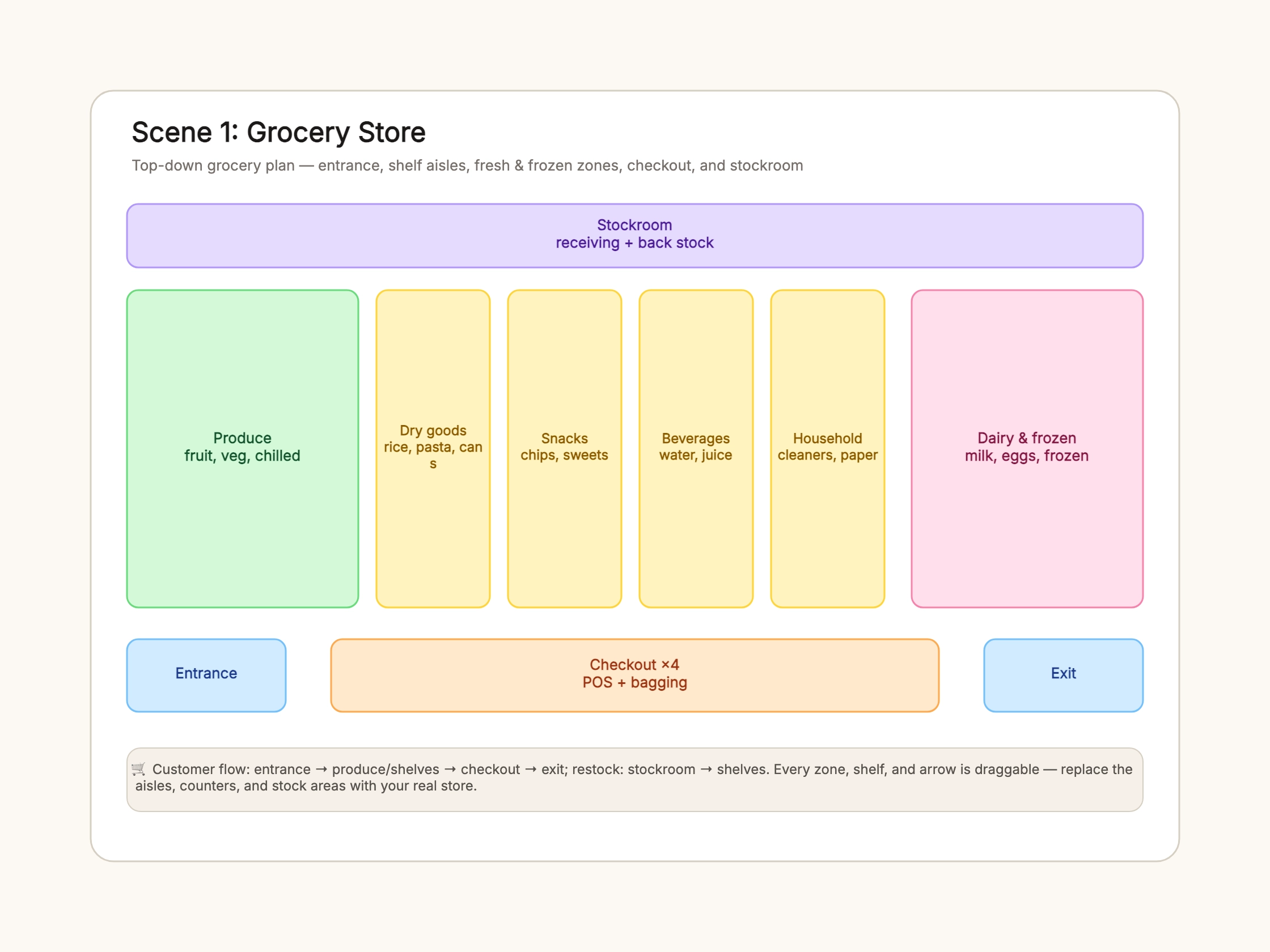
Grocery store (full-size)
Who uses it: A store owner or manager opening a supermarket
Entrance / exit: front doors with checkout lanes in between
Perimeter: produce on the left, dairy & frozen on the right
Center aisles: dry goods, snacks, beverages, household
Checkout: four lanes with POS and bagging
Stockroom: receiving + back stock along the back wall
Flow: customers one way, restock from the back (dashed)
Why this works: This is the template's default scene. The value is the perimeter-vs-center split and the separated flows: fresh zones stay on the outside where the plumbing is, dry goods fill the middle, and the restock path stays off the customer path so a delivery never blocks an aisle during a rush.
Clothing boutique
Who uses it: A boutique owner planning a browse-first apparel shop
Window display: mannequins at the front to pull shoppers in
Racks: new arrivals, tops, bottoms, outerwear in the middle
Fitting rooms: three rooms near the back with a mirror
Shoes & accessories: along the side wall
Checkout: front and center with gift wrap
Flow: entrance → racks → fitting rooms → checkout → exit
Why this works: A clothing store trades shelf density for dwell time, so the plan spaces the racks to let two shoppers pass and puts fitting rooms near the back to draw people through the whole floor. The window display and the fitting rooms do the selling; the racks just need to be easy to walk.
Thrift store
Who uses it: A thrift or secondhand shop operator maximizing rack density
Entrance: wide, with a donation drop near the door
Racks: clothing by category, packed tighter than a boutique
Shelves: home goods, books, and electronics along the walls
A small fitting area or a communal mirror instead of private rooms
Checkout: a fast single line near the exit
Flow: a loose free-flow loop, checkout visible from the door
Why this works: A thrift store layout leans on volume and fast turnover, so it packs racks denser than a boutique and often skips dedicated fitting rooms for a communal mirror. The layout stays a free-flow loop with the checkout visible from the entrance, so shoppers self-serve and a single cashier keeps the line moving.
Convenience store
Who uses it: A convenience or corner-store operator optimizing a small unit
Counter up front: cashier, oden, and coffee by the register
Fridges & freezers: drinks, dairy, and ice cream along the back
Shelves: snacks, daily goods, instant food, and drinks in between
Hot-food corner: oden and heat-up next to the counter
Stockroom: small receiving area behind the counter
Flow: a short one-directional loop — in, grab, pay, out
Why this works: A convenience store is a counter-forward plan built for a short trip. High-margin items (drinks, snacks, hot food) sit on the path to the register, fridges line the back wall, and the stockroom is tucked behind the counter so restock doesn't cross the sales floor. The whole layout pushes shoppers in one short loop.
Pharmacy / health store
Who uses it: A pharmacist or retail manager laying out a drugstore
Prescription counter: at the back, visible from the entrance
OTC aisles: cold & flu, vitamins, and personal care in the middle
Perimeter: beauty, baby, and seasonal on the outer walls
Checkout: front registers with impulse items by the queue
Stockroom: secure receiving for controlled items
Flow: entrance → aisles → pharmacy → checkout
Why this works: A pharmacy puts the prescription counter at the back so shoppers pass the whole floor to reach it, with OTC aisles in the middle and higher-margin beauty and seasonal along the perimeter. The checkout queue doubles as an impulse-buy zone, and the stockroom is secured for controlled items.
Pop-up / market stall layout
Who uses it: A vendor planning a temporary retail space or market stall
Entrance: one wide opening, with the register beside it
Display tables: product arranged by category in a U-shape
Back stock: a small hidden storage behind the tables
Checkout: a single point near the exit so the line exits cleanly
Flow: a U-shaped path that passes every table once
Why this works: A pop-up or market stall compresses the store layout into a U-shape so shoppers pass every display table exactly once on the way to the register. Back stock hides behind the tables, and a single checkout near the exit keeps the line from blocking the entrance — the same one-directional logic as the convenience scene, shrunk further.