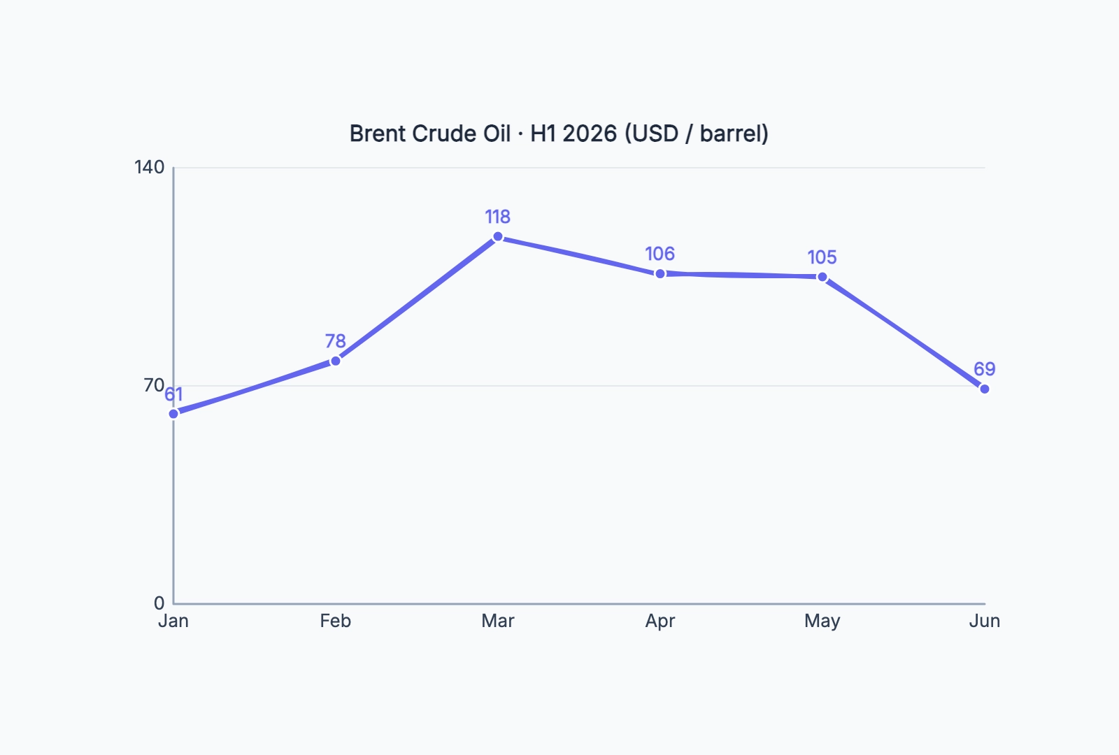
Commodity price trend
Who uses it: Analyst or writer explaining a price move behind a news story
Jan: 61
Feb: 78
Mar: 118
Apr: 106
May: 105
Jun: 69
Why this works: A price trend line makes the rise-and-fall story instantly readable: the Q1 spike and the later pullback are obvious in a way a row of numbers never is. Label the turning points to tie the shape to the events behind it.
Monthly revenue
Who uses it: Founder or finance lead sharing growth in an investor update
Jan: 12
Feb: 18
Mar: 21
Apr: 28
May: 35
Jun: 44
Why this works: A steady upward revenue line is the single most persuasive chart in an update. Keep the axis honest (start at 0) so the growth reads as real, not exaggerated by a truncated scale.
Weekly active users
Who uses it: Product manager tracking engagement for the team
W1: 1,200
W2: 1,350
W3: 1,300
W4: 1,580
W5: 1,720
W6: 1,690
Why this works: Plotting WAU week over week surfaces the small dips and recoveries that a monthly number hides — useful for spotting whether a release moved the needle.
Website traffic over a campaign
Who uses it: Marketer reporting on a launch or campaign window
Day 1: 800
Day 2: 2,400
Day 3: 3,100
Day 4: 1,900
Day 5: 1,200
Day 6: 950
Why this works: A traffic line around a launch shows the spike and the decay clearly — the slope down after the peak tells you how long the campaign's attention actually lasted.
Temperature log
Who uses it: Student, hobbyist, or anyone tracking a measurement over time
Mon: 18
Tue: 21
Wed: 23
Thu: 22
Fri: 19
Sat: 17
Why this works: Any logged measurement — temperature, weight, sensor reading — becomes a readable trend on a line chart. Keep the interval (daily here) consistent so the shape isn't distorted.
Test score progress
Who uses it: Teacher or learner tracking improvement across attempts
Test 1: 62
Test 2: 68
Test 3: 71
Test 4: 79
Test 5: 84
Test 6: 88
Why this works: A score-over-attempts line turns a list of grades into a visible improvement curve — far more motivating, and it makes a plateau or dip easy to catch early.