Back to template

Kubernetes Architecture Diagram Examples

These Kubernetes diagram examples show how different teams map their cluster topology for documentation, onboarding, and incident response. Each example covers a real deployment scenario so you can copy the structure and adapt it to your own cluster.

Kubernetes Architecture Diagram Examples

Real examples

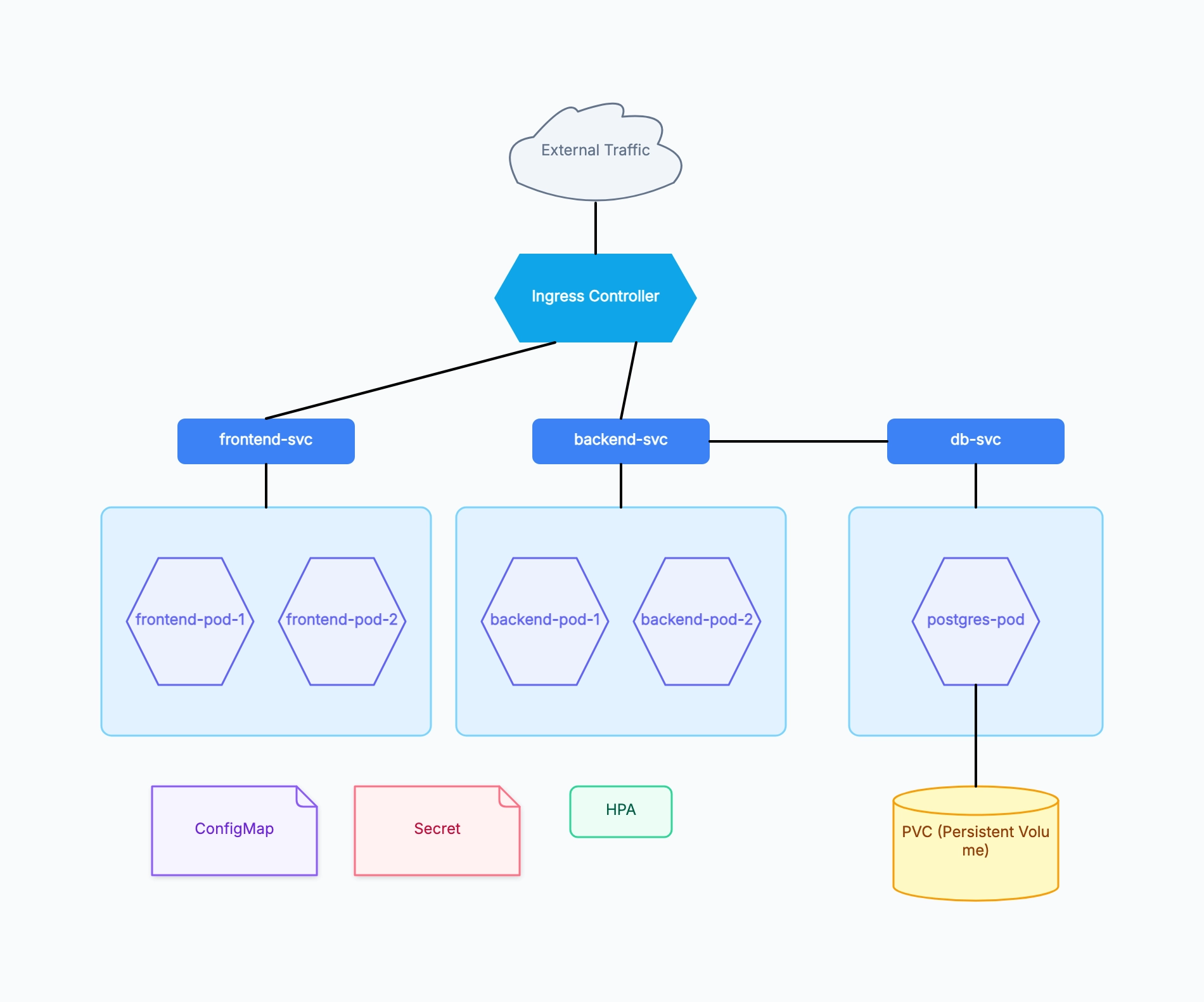
Three-tier web application

Who uses it: Backend engineer documenting a standard stateful web app deployment

Ingress: nginx ingress controller handling TLS termination
frontend-svc → 2 frontend pods (React app, Node.js SSR)
backend-svc → 2 backend pods (REST API, Python/Go)
db-svc → 1 postgres pod with PVC for durable storage
ConfigMap: environment variables; Secret: DB credentials
HPA on backend deployment, target CPU 70%

Why this works: Separating workloads across three dedicated worker nodes makes the blast radius of a node failure immediately visible — if Node 3 goes down, only the database is affected, not the stateless frontend or backend.

Microservices platform with service mesh

Who uses it: Platform engineer running 10+ services behind Istio

Ingress Gateway (Istio) as the single entry point
Namespace: auth → auth-service pod + redis-cache pod
Namespace: catalog → catalog-service + search-service pods
Namespace: orders → order-service + payment-service pods
Istio sidecar proxies injected into every pod
Prometheus + Grafana in monitoring namespace

Why this works: Grouping services by namespace in the diagram maps directly to Kubernetes RBAC and network policy boundaries — readers can immediately see which teams own which services and where network traffic is allowed to flow.

Data processing cluster (Spark on K8s)

Who uses it: Data engineer running batch jobs and streaming pipelines on Kubernetes

Spark driver pod → multiple Spark executor pods (dynamic allocation)
Kafka consumer pods in streaming namespace
MinIO pods for object storage (S3-compatible)
Spark History Server for job monitoring
Persistent Volume Claims for shuffle storage
CronJob resource triggering nightly batch runs

Why this works: For data workloads, showing the dynamic nature of executor pods (they scale up per job and terminate afterward) alongside the persistent infrastructure (Kafka, MinIO) helps the team understand which costs are fixed and which are variable.

Student lab cluster for learning Kubernetes

Who uses it: Computer science student or bootcamp grad setting up a local or cloud lab

Single worker node (minikube or kind)
nginx-pod exposed via NodePort service
mysql-pod with hostPath volume (lab-grade storage)
Deployment and ReplicaSet resources labeled
kubectl port-forward for local access

Why this works: Even a minimal one-node lab cluster benefits from a diagram — it forces the learner to think about the relationship between Deployment, ReplicaSet, and Pod before touching kubectl, which prevents the common confusion about why deleting a pod doesn't stop it from coming back.

Multi-tenant SaaS cluster

Who uses it: SaaS company running one cluster for multiple enterprise customers

Namespace per tenant with LimitRange and ResourceQuota
Shared ingress controller with host-based routing
Shared monitoring stack in ops namespace
Tenant-isolated databases with separate PVCs
Cluster-level RBAC roles vs namespace-level roles

Why this works: Multi-tenant diagrams help compliance and security reviewers verify that tenant isolation is enforced at the namespace level rather than relying only on application-layer access controls.
Tips for better Kubernetes architecture diagrams

  • Use the pod hexagon shape to immediately signal Kubernetes semantics — readers familiar with K8s will orient faster.
  • Show namespaces as containing frames so readers understand which resources share the same RBAC and network policy scope.
  • Draw the ingress → service → pod flow from top to bottom to match the mental model of traffic flowing down into the cluster.
  • Add PVC nodes only to pods that actually write durable data — not every pod needs storage, and over-adding storage symbols creates noise.

How it compares to similar tools

Architecture diagram vs `kubectl get all`

kubectl gives you the live state as a flat list, but topology is invisible: what calls what, where traffic enters, which Service backs which Pods. A diagram trades real-time accuracy for readable relationships, which is why they're complementary — kubectl for debugging, diagrams for explaining and reviewing.

Architecture diagram vs Helm charts / raw YAML

YAML is written for the cluster; a diagram is written for humans. Confirming which PVC a Deployment mounts can mean opening three YAML files, while a diagram shows it at a glance. For onboarding, incident retrospectives, and cross-team review, a diagram is measurably faster than reading the chart.

Kubernetes diagram vs generic microservices diagram

A generic microservices diagram shows service-to-service calls and ignores where things run. A Kubernetes diagram has to express K8s-specific layers: Namespace boundaries, the selector relationship from Service to Pods, replica counts, and whether storage is durable. If your diagram still makes sense with those removed, it's a microservices diagram — not a K8s one.

Hand-drawn style vs official icon sets

Formal deliverables benefit from official icons and strict conventions. But for whiteboard discussions where you edit while you talk, hand-drawn style works better — it signals "this is still a draft," so colleagues are more willing to mark it up instead of treating it as settled architecture.

Common mistakes to avoid

  • Drawing Service and Pod as one-to-one

    The most common mistake. A Service targets a *set* of Pods via label selector, and that count changes. Drawing it one-to-one implies scaling requires editing the Service, hiding the decoupling that is Kubernetes' core design. Instead: connect one Service to a Pod group box and label the replica count on the box.

  • Omitting Namespace boundaries

    Skipping Namespaces makes the diagram look cleaner but drops the most important isolation detail — RBAC permissions and NetworkPolicies apply per Namespace. Readers can't tell whether a cross-service call needs an extra allow rule.

  • Attaching storage to every Pod

    Stateless Pods don't need a PVC. Adding storage icons everywhere makes it impossible to see which components actually need backup and migration planning — exactly the thing a disaster-recovery review needs to establish first.

  • Mixing the control plane into the workload layer

    API Server, etcd, and Scheduler are control plane; your application Pods are data plane. Drawing them in one layer suggests application traffic flows through the API Server, when requests actually go Ingress → Service → Pod and never touch the control plane. On managed clusters (EKS/GKE), omit it or isolate it in a shaded area.

Frequently asked questions

How detailed should a Kubernetes architecture diagram be?+

Match the reader. For onboarding: Services and Pod groups, plus where traffic enters and where data is persisted. For SRE runbooks: add replica counts, HPA thresholds, PVCs, and zone distribution. For leadership: keep it at Namespace-level blocks. Three diagrams of the same cluster at different granularity beat one diagram that tries to show everything.

Should I include ConfigMaps and Secrets?+

It depends on the diagram's purpose. They're noise when you're explaining traffic topology, so leave them out. But if the diagram supports config auditing or debugging "why do two environments behave differently," include them and label exactly which Pods mount which ConfigMap. Don't add them just for completeness.

How do I diagram multi-cluster or multi-zone setups?+

Use an outer frame per cluster or availability zone, and inside each one show only what differs — write "same as above" instead of duplicating identical structure. Draw cross-boundary traffic (global load balancing, inter-cluster sync) as lines crossing the frames, ideally in a distinct color, since those links are usually the focus of latency and failure-domain analysis.

Do I need the control plane for managed clusters like EKS or GKE?+

Usually not. On managed clusters the provider runs the control plane; you can't modify it and don't operate it, so drawing it just consumes space. The exception is when the diagram's whole purpose is explaining the shared-responsibility boundary — then a shaded "provider-managed" area becomes the point of the diagram.

How do I keep the diagram in sync with the real cluster?+

Don't expect a hand-made diagram to stay precisely in sync — that always fails. Instead, let the diagram express *intent and topology*, which changes slowly, and leave live state to kubectl and dashboards. Put a "last updated" date on the diagram and update it as part of architecture-change review; that's more realistic than chasing auto-generation.

Start editing online

Go back to the template, swap in your own content, and keep the same structure if it fits your project.

Use this template: /editor/new?template=kubernetes-architecture

Edit this Kubernetes architecture template