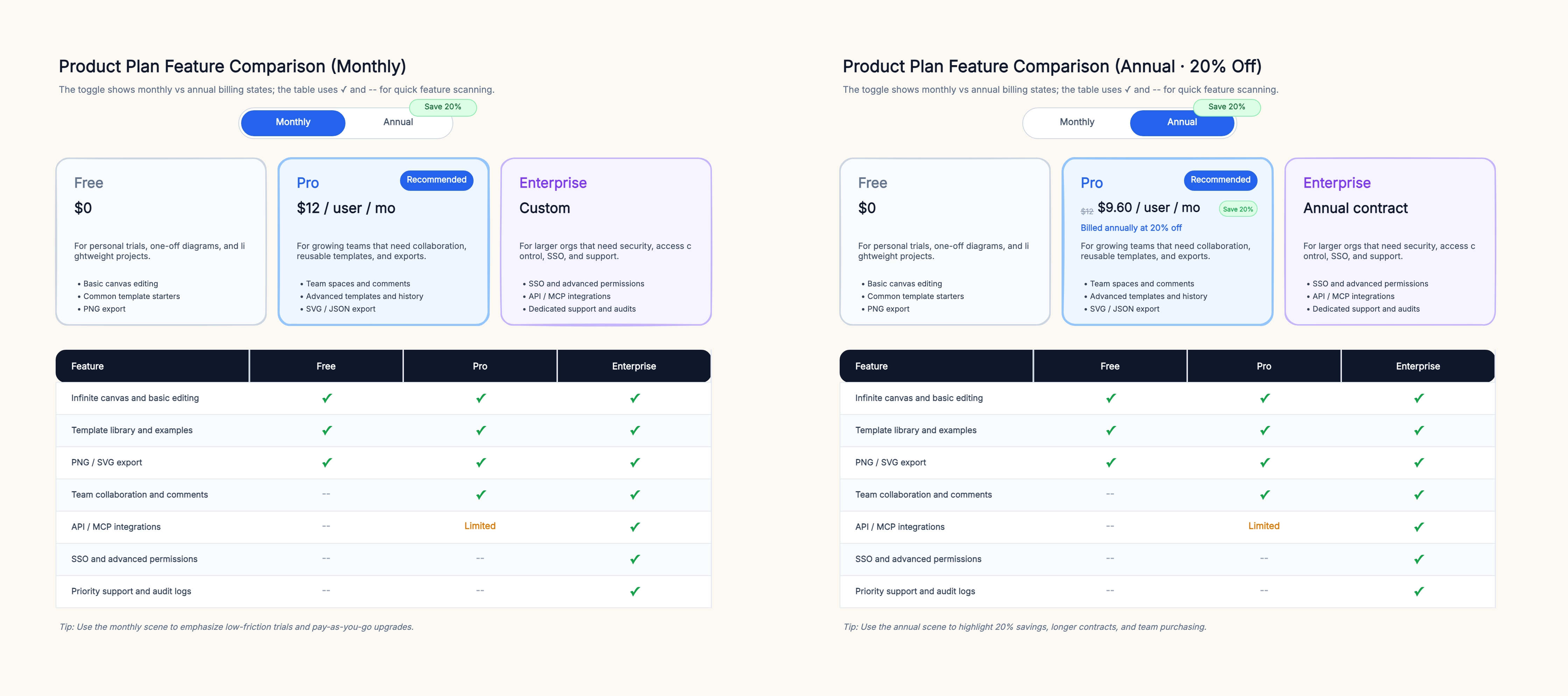
SaaS Pricing Page
Who uses it: Product marketers and founders
Plan: Free / Pro / Enterprise
Features: Storage (5GB / 100GB / Unlimited), Users (1 / 10 / Unlimited), Support (Community / Email / Priority), API (✗ / ✓ / ✓), SSO (✗ / ✗ / ✓)
Price: $0 / $29/mo / Custom
Why this works: SaaS companies use comparison tables on their pricing pages to help visitors choose a plan without needing a sales call. The key is to make the differences between plans visually obvious — the eye should go straight to the column with the most checkmarks.
Vendor Selection Matrix
Who uses it: Procurement teams and engineering leads
Criteria: Feature Completeness / Documentation Quality / Community Size / Pricing Model / SLA
Vendor A: ✓✓✓ / ✓✓ / ✓✓✓ / Subscription / 99.9%
Vendor B: ✓✓ / ✓✓✓ / ✓ / Per-seat / 99.5%
Vendor C: ✓✓✓ / ✓ / ✓✓ / One-time / 99.99%
Why this works: Procurement teams use weighted comparison tables to evaluate vendors objectively. Each criterion gets a weight, and each vendor gets a score. The weighted total removes gut feeling from the decision and creates an auditable record of why a vendor was chosen.
Competitive Analysis for Product Launch
Who uses it: Product managers
Feature: Auto-save / Real-time collaboration / Offline mode / Mobile app / API
Our Product: ✓ / ✓ / ✗ / ✓ / ✓
Competitor A: ✗ / ✓ / ✓ / ✗ / ✓
Competitor B: ✓ / ✗ / ✗ / ✓ / ✗
Why this works: Before launching a feature or entering a market, product teams map the competitive landscape in a table. Gaps that are invisible when you look at one competitor at a time become obvious when you see them side by side. The table becomes the foundation of the product strategy document.
Candidate Comparison for Hiring
Who uses it: Hiring managers and recruiters
Criterion: Years of Experience / Relevant Tech Stack / Team Leadership / Communication / Salary Expectation
Candidate 1: 5 yrs / ✓✓ / ✗ / ✓✓✓ / $120K
Candidate 2: 8 yrs / ✓✓✓ / ✓✓ / ✓ / $155K
Candidate 3: 3 yrs / ✓ / ✗ / ✓✓ / $95K
Why this works: Hiring committees use comparison tables to reduce bias. When each candidate is evaluated against the same criteria and the evidence is visible in each cell, the discussion shifts from 'I liked candidate X' to 'candidate Y scores higher on the criteria that matter most for this role.'
Internal Tool Selection
Who uses it: Engineering and operations teams
Tool: Jira / Linear / Asana / Monday
Criteria: Sprint Planning / Kanban / Roadmap / Integration / Price per Seat
Jira: ✓✓✓ / ✓ / ✓✓ / ✓✓✓ / $7.75
Linear: ✓✓ / ✓✓ / ✓ / ✓✓ / $8
Asana: ✓ / ✓✓ / ✓✓✓ / ✓✓ / $10.99
Monday: ✓ / ✓✓ / ✓✓ / ✓✓✓ / $9
Why this works: Teams choosing between similar tools need to see differences in one view. A table that maps features to tools prevents the team from getting stuck on one tool's standout feature and ignoring other tools' advantages in areas that matter more to the daily workflow.