Design thinking workshop — e-commerce checkout flow
Who uses it: UX team running a design sprint to improve checkout conversion
Says: 'I don't want to create an account just to check out' | 'Is my payment info safe?'
Thinks: Why do they need my phone number? | I'll just use Apple Pay instead
Does: Abandons cart at account creation step | Opens competitor tab
Feels: Annoyed by friction | Suspicious of data requests
Pains: Forced account creation | Too many form fields | No guest checkout
Gains: One-click checkout | Apple Pay / Google Pay support | Guest checkout visible
Why this works: This empathy map was built from 5 usability test sessions of an e-commerce checkout flow. The key insight came from the Says/Thinks contradiction: users say 'account creation is fine' but think 'I'll use Apple Pay instead' — revealing that they tolerate accounts but avoid them when possible. The resulting action item was to move guest checkout above the account creation button.
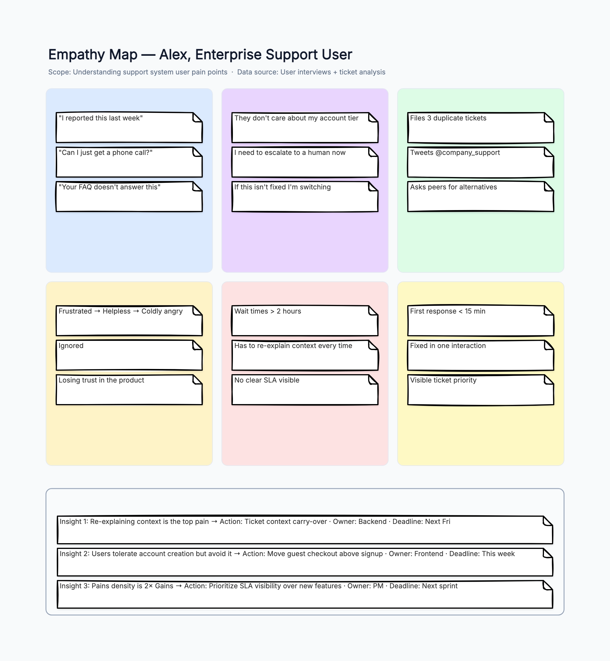
SaaS support team — ticket system pain points
Who uses it: Product manager and support team diagnosing high churn rates
Says: 'I reported this last week' | 'Can I just get a phone call?'
Thinks: They don't care about my account tier | I need to escalate now
Does: Files 3 duplicate tickets | Tweets @company_support | Asks peers
Feels: Frustrated → Helpless → Coldly angry | Losing trust in the product
Pains: Wait times > 2 hours | Has to re-explain every time | No SLA visible
Gains: First response < 15 min | Fixed in one interaction | Visible priority
Why this works: This map came from a combination of support ticket analysis and 3 customer interviews. The highest-density area was 'Pains' — every single user mentioned re-explaining context as a top frustration. The team's action item was to implement a 'context carry-over' feature that pre-populates ticket history for returning users.
Team empathy map — engineering vs product alignment
Who uses it: Engineering team lead facilitating cross-functional understanding
Says: 'Product keeps changing requirements mid-sprint' | 'I need clear specs'
Thinks: They don't understand how long things take | I'm just a ticket machine
Does: Asks for written specs 3 times | Starts coding without full context
Feels: Resentful | Drained by context switching | Underappreciated
Pains: Unclear requirements | Last-minute changes | No design review time
Gains: Clear acceptance criteria | 2-week planning horizon | Dedicated spec review
Why this works: A team empathy map is powerful because it surfaces assumptions that cross-functional teams make about each other. This one revealed that engineers assume 'product changes requirements on purpose' while product managers were equally frustrated by the lack of quick iteration. The insight led to a shared 'spec freeze' window: the last 2 days of each sprint are spec-locked.
Personal empathy map — career transition
Who uses it: Professional considering a career change using self-reflection
Says: 'I like my current job' | 'The pay is good' | 'I'm learning here'
Thinks: I'm bored | I've plateaued | My skills are stagnating
Does: Browses job boards on weekends | Takes online courses half-heartedly
Feels: Guilty for wanting to leave | Anxious about the unknown | Restless
Pains: No growth path visible | Work feels repetitive | Impostor syndrome
Gains: Clear career ladder | Mentorship opportunities | Impact I can see
Why this works: The personal empathy map revealed a classic Says/Thinks conflict: the user publicly justifies staying ('good pay,' 'learning') while privately feeling bored and stagnant. The insight: the real need isn't 'find a new job' — it's 'find visible growth within the next 6 months or get clear on what's missing.' The action was to schedule a skip-level career conversation.
Student UX researcher — mobile app usability test
Who uses it: UX student conducting a first-ever usability test for a class project
Says: 'The navigation is confusing' | 'Where do I find my profile?'
Thinks: I feel stupid for not finding it | Everyone else seems to get it
Does: Clicks randomly | Uses search bar even for navigation | Asks for help
Feels: Frustrated with self | Embarrassed | Relieved when task is done
Pains: Unclear information architecture | Too many menu levels | No search
Gains: Simple navigation with 3 levels max | Visible search bar | Breadcrumbs
Why this works: A common mistake for student researchers is assuming users will 'figure it out.' This map captured that users don't blame the design — they blame themselves. The Says/Thinks gap ('navigation is confusing' vs 'I feel stupid') is a crucial insight: users won't complain unless explicitly asked, so passive analytics alone miss the emotional cost of poor UX.