Back to template

Auth Page Examples

These auth page examples show common login and signup patterns that product teams use before writing production UI. Each example focuses on the structure of the flow rather than final visual styling.

Auth Page Examples

Real examples

SaaS product signup

Who uses it: Product manager designing a self-serve onboarding flow

Top: Create account headline + short value proposition
OAuth: Continue with Google, Continue with GitHub
Divider: or use email
Fields: name, work email, password
Primary CTA: Create account
Footer: Already have an account? Sign in

Why this works: Putting OAuth above email reduces friction for users who already trust their identity provider. Keeping the email form on the same screen preserves a fallback for users who cannot use OAuth.

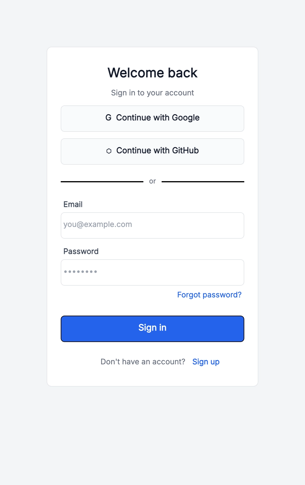
Developer tool login

Who uses it: Founder or engineer building a tool for developers

Primary OAuth: GitHub first, then Google
Email/password fallback under a divider
Forgot password link right-aligned below password
Security note: SSO and two-factor support available on paid plans

Why this works: Developer products often prioritize GitHub because it carries stronger workflow intent than generic social login. The diagram makes that hierarchy visible before UI details are finalized.

Enterprise SSO screen

Who uses it: B2B product team planning an enterprise login flow

Single input: work email
Continue button detects organization domain
Route to SAML/SSO if domain is managed
Fallback: password login for unmanaged users
Help link: Contact your workspace admin

Why this works: Enterprise auth often starts with email discovery rather than a password field. Showing this as a flow avoids mixing consumer login patterns with managed organization behavior.

Mobile app onboarding auth

Who uses it: UX designer mapping the first-run mobile experience

Welcome screen: value prop + Get started
Signup: Apple/Google first, email below
Optional profile setup after account creation
Skip non-critical fields until after activation

Why this works: Separating account creation from profile setup keeps the first step focused. The wireframe makes it easier to decide which fields are truly required before a user sees value.

Tips for better study mind maps

  • Do not ask for information you do not need yet; every extra field increases signup friction.
  • Keep primary and secondary actions visually distinct so users know how to continue.
  • Place account-switch links near the bottom of the card, where users expect login/signup toggles.
  • Show OAuth and email paths in the same diagram so engineering can plan both backend flows.

Start editing online

Go back to the template, swap in your own topics, and keep the same structure if it fits your class or project.

Use this template: /editor/new?template=auth-page

Use this auth page template