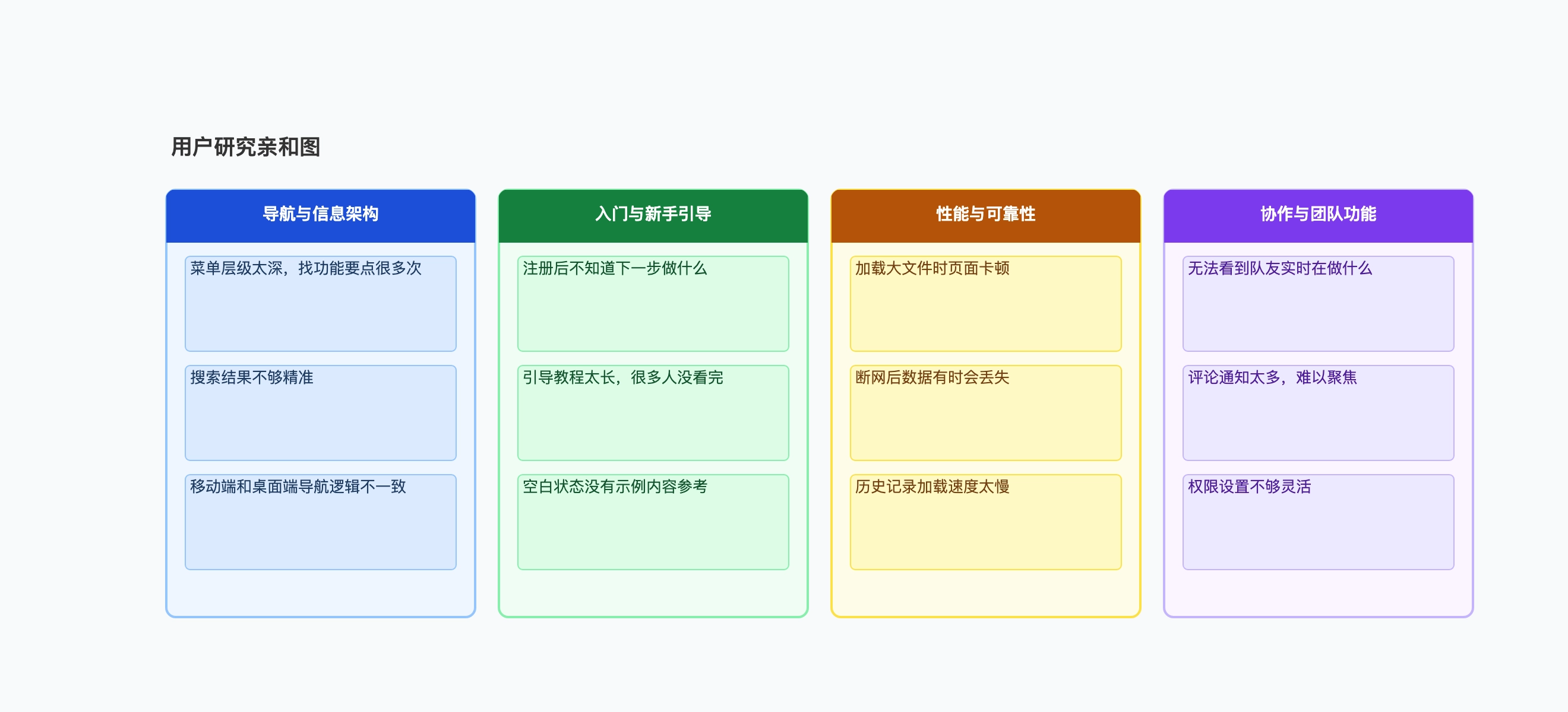
Back to template

Affinity Diagram Examples

These affinity diagram examples show how different teams use the KJ method to turn raw qualitative data into structured insight themes. Use them as a reference for your own synthesis sessions.

Affinity Diagram Examples

Real examples

User interview synthesis

Who uses it: UX researcher synthesizing 12 user interviews for a B2B SaaS product

Onboarding friction: unclear first steps, too many fields, no sample data
Navigation: deep menu structure, inconsistent mobile behavior, poor search
Collaboration: no real-time visibility, notification overload, rigid permissions
Performance: large file lag, offline data loss, slow history loading
Trust & security: unclear data ownership, no audit log, SSO not supported

Why this works: The 'Trust & Security' cluster emerged late in the sort — none of the individual notes seemed important, but together they pointed to a significant blocker for enterprise buyers that hadn't appeared in surveys.

Sprint retrospective

Who uses it: Agile team running a retrospective after a difficult sprint

What went well: clear sprint goal, effective daily standups, good peer reviews
What didn't: unclear requirements on two stories, blocked by external API, scope crept mid-sprint
Process gaps: no clear owner for cross-team dependencies, no definition of done for integrations
To try next sprint: dependency log, spike before estimation, freeze scope after day 3

Why this works: Grouping 'blocked by external API' and 'no owner for cross-team dependencies' into a Process Gaps cluster made it clear the team needed a structural fix, not just better communication.

Product discovery synthesis

Who uses it: Product manager synthesizing customer calls before a roadmap session

Reporting & visibility: no dashboard for managers, can't export to Excel, manual status updates
Integration needs: Slack, Jira, Google Sheets mentioned in 80% of calls
Mobile experience: app crashes on Android, no offline mode, hard to approve requests on mobile
Onboarding: long setup time, no templates for common workflows, admin config too complex

Why this works: The integration cluster was expected, but the mobile experience cluster surprised the team — no one had flagged mobile as a priority before the synthesis session.

Design thinking workshop

Who uses it: Cross-functional team ideating on a new employee onboarding experience

Information overload: too many systems to learn, unclear priority, no learning path
Social isolation: no buddy system, hard to find meeting rooms, no team introduction ritual
Tools & access: laptop setup takes 2 days, no standard tooling, IT bottleneck
Culture & clarity: unclear who does what, no visibility into team goals, no first-week agenda

Why this works: The 'Social Isolation' cluster was the most actionable outcome — it required no tooling investment and could be addressed with simple process changes like a buddy program.

Customer support feedback analysis

Who uses it: Support team grouping six months of ticket notes to identify systemic issues

Billing confusion: unclear invoice line items, refund process unknown, free trial end not notified
Feature discoverability: users unaware of existing features, no contextual help, buried settings
Error messages: cryptic codes, no suggested fix, errors not logged for support team
Documentation gaps: outdated help articles, missing API docs, no video tutorials

Why this works: The 'error messages' cluster led directly to a quarterly engineering initiative — cryptic errors were generating 30% of all support tickets, and fixing them had no previous ticket cluster to justify the priority.

Survey open-text synthesis

Who uses it: Product analyst grouping 400 open-text NPS responses

Speed and reliability (NPS detractors): slow load times, sync failures, frequent bugs
Feature gaps (detractors): missing API, no bulk actions, limited export options
Ease of use (promoters): simple interface, quick to learn, good default templates
Support quality (promoters): fast response, knowledgeable team, proactive updates

Why this works: Grouping NPS verbatims by promoter vs. detractor theme gave the product and support teams separate action agendas — the detractor clusters drove the roadmap, the promoter clusters informed marketing messaging.

Tips for better study mind maps

  • Resist naming clusters until the sorting is mostly done — pre-defined categories bias where you put the cards.
  • A cluster with only one card is not a cluster. Either find similar cards it belongs with, or set it aside as an outlier to revisit.
  • The best cluster names are nouns that describe the shared theme, not verbs or action items — 'Navigation confusion' rather than 'Fix navigation'.
  • Time-box the initial sort to 20–30 minutes per round. Longer sessions produce diminishing returns and participant fatigue.

Start editing online

Go back to the template, swap in your own topics, and keep the same structure if it fits your class or project.

Use this template: /editor/new?template=affinity-diagram

Use this affinity diagram template